
Rio Tinto
Portside WeChat App
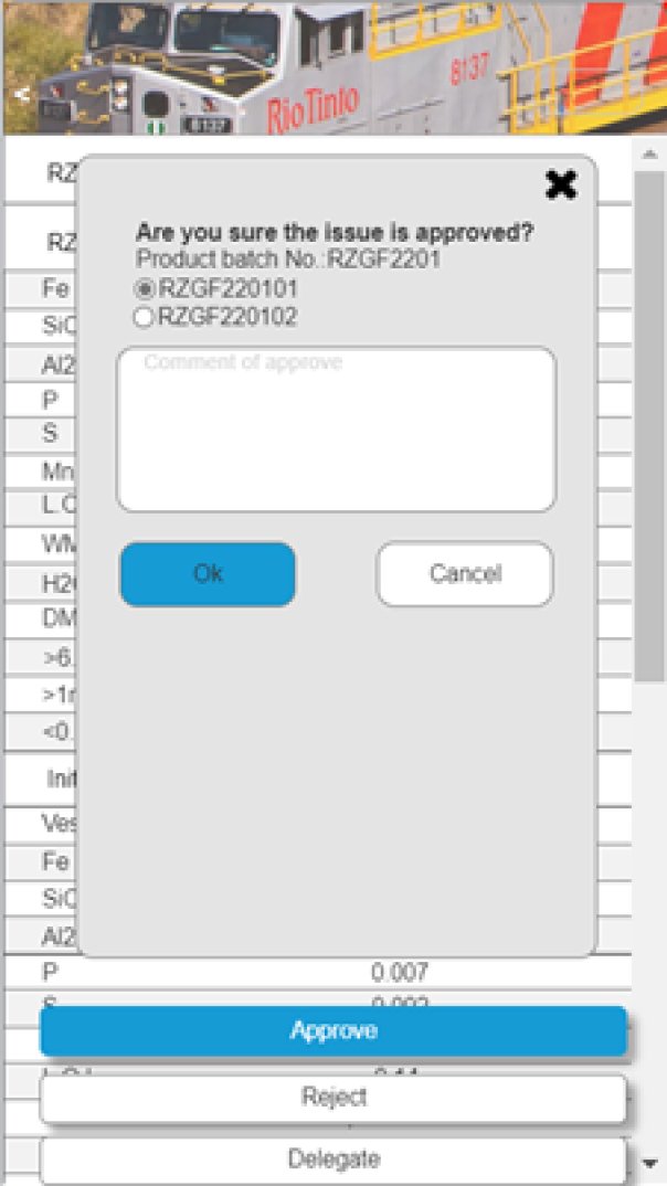
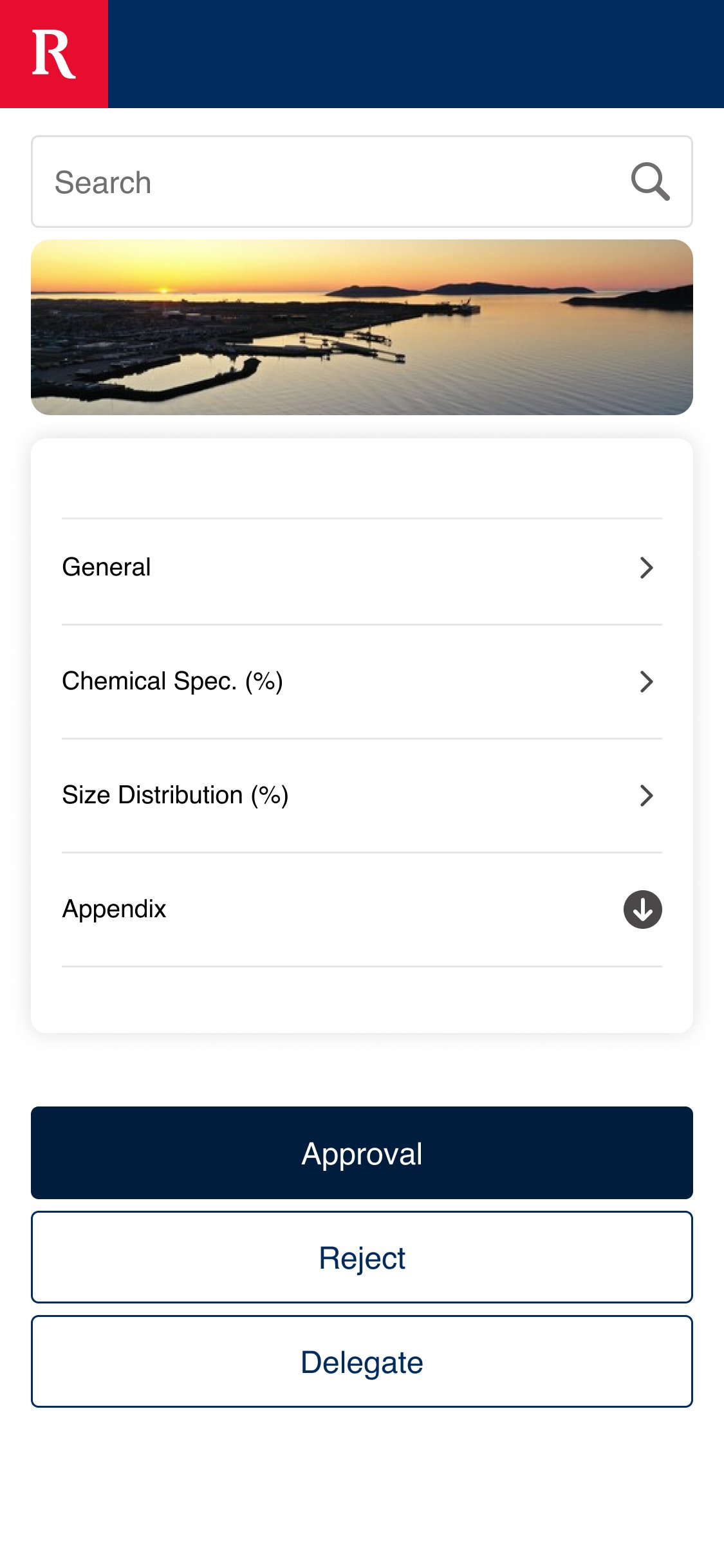
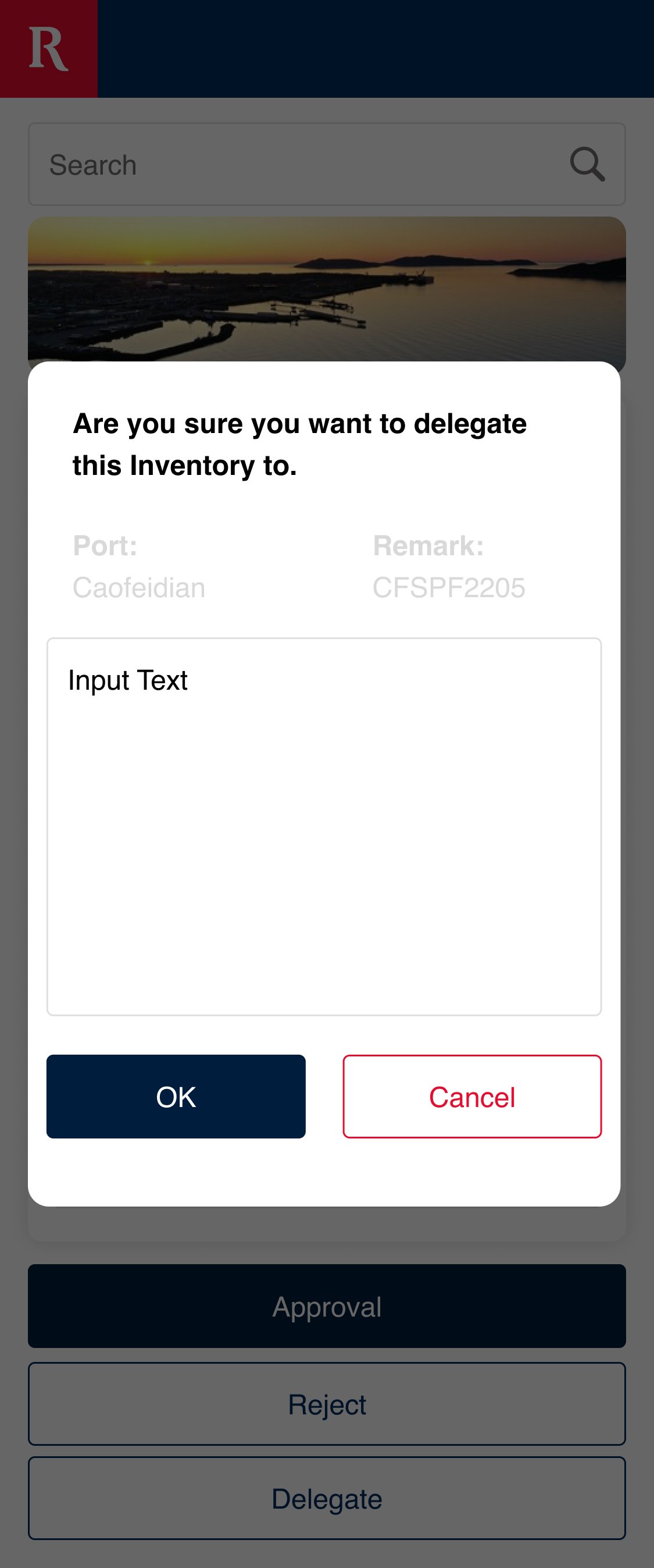
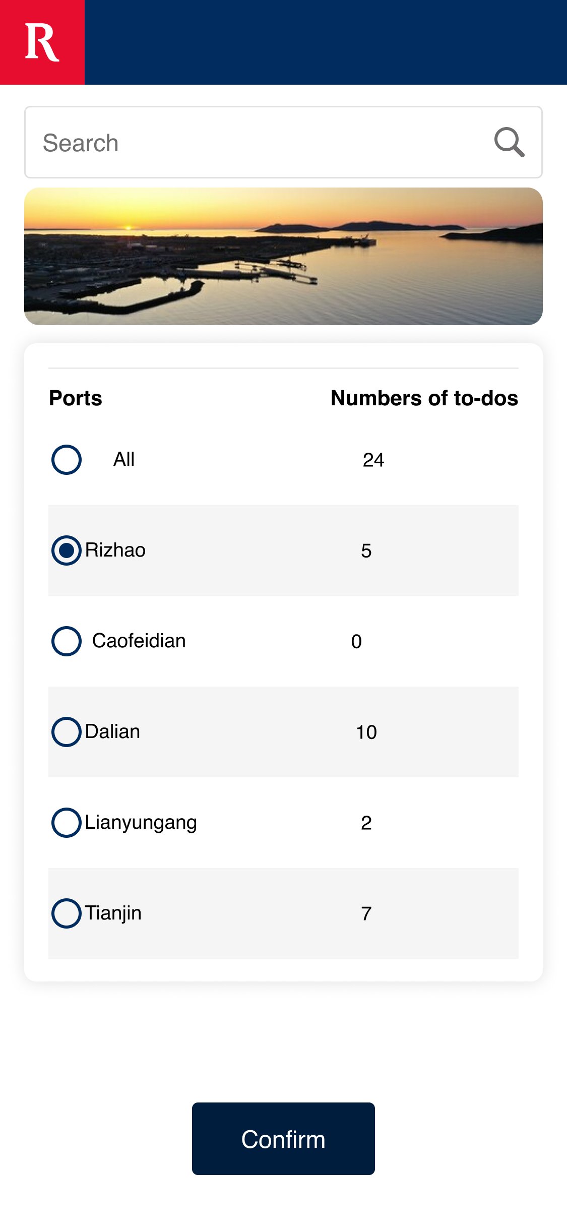
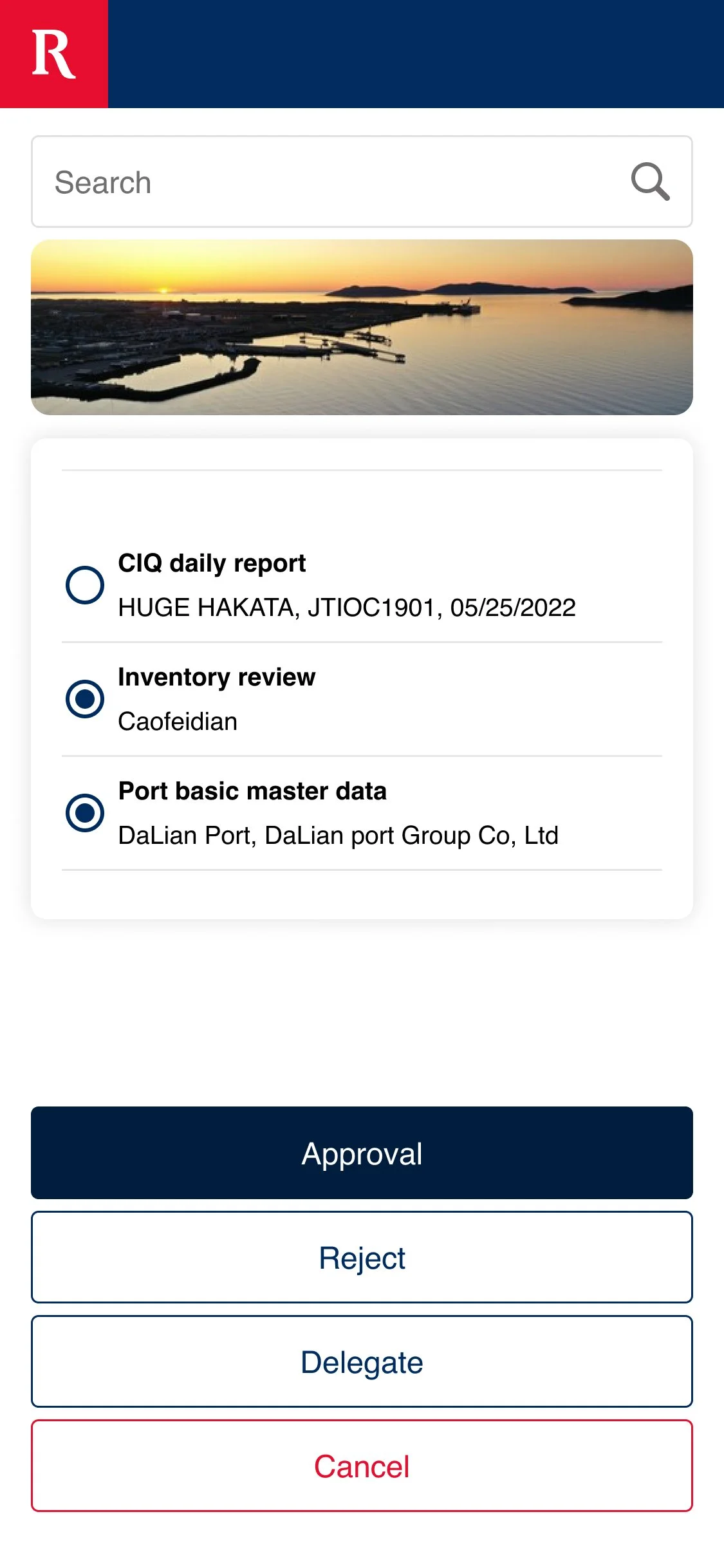
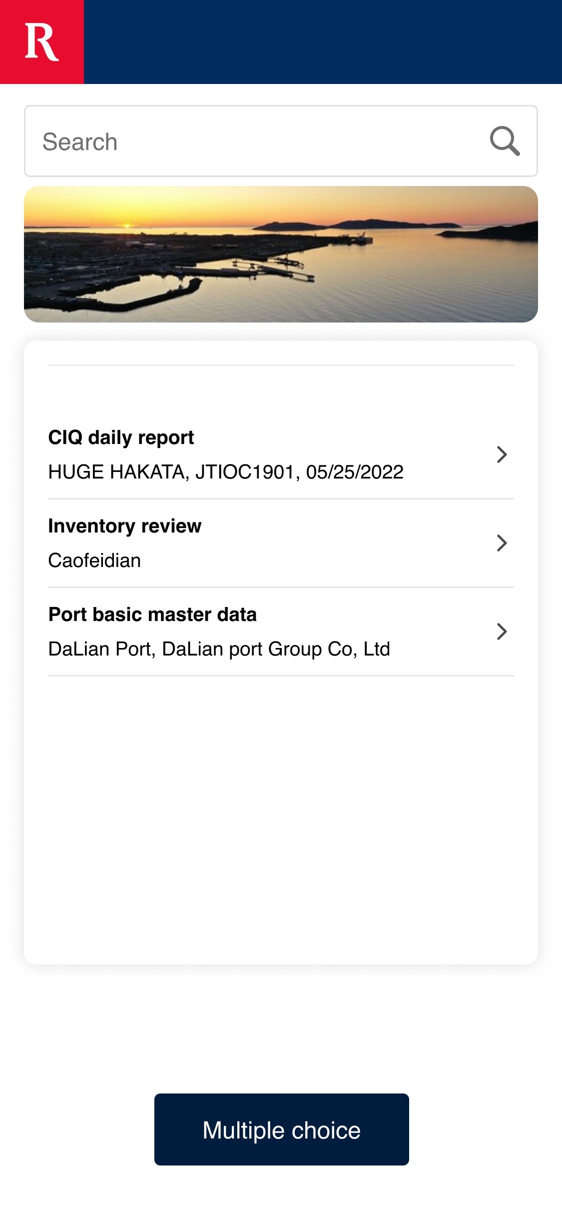
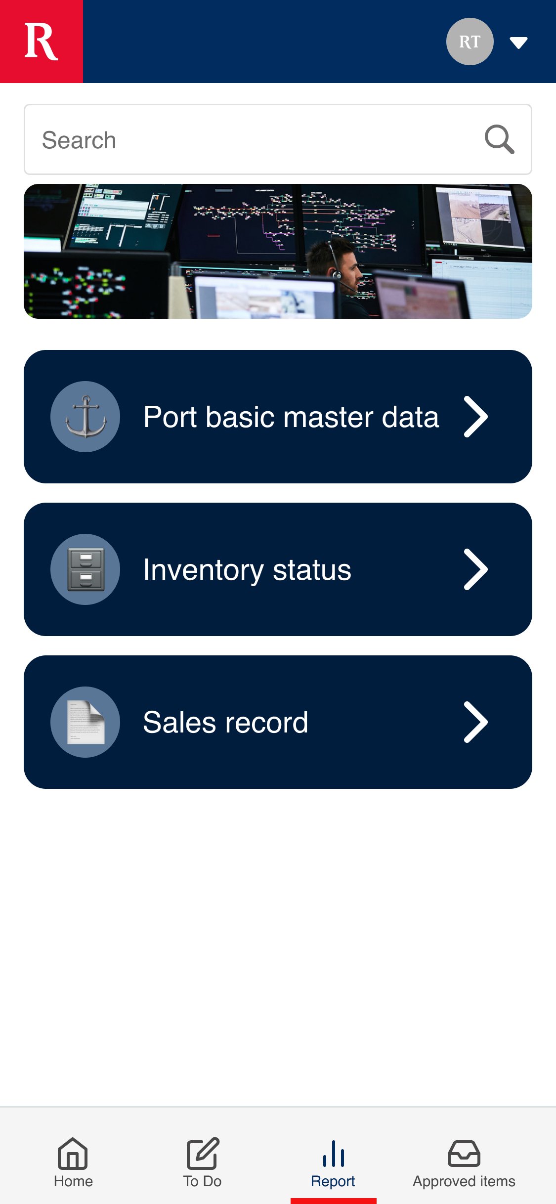
The Portside IMS system replaces manual stockpile recording with a digital system, providing real-time stock levels at each port. By integrating SAP and Admin Portal, data is synced automatically, eliminating manual entry. A WeChat mobile app allows leaders to manage approvals and delegate tasks on the go. This system has reduced processing time, improved data accuracy, and increased business resilience. It also supports the purchase of port side iron ore spot cargos through the WeChat app and web portal.
Features
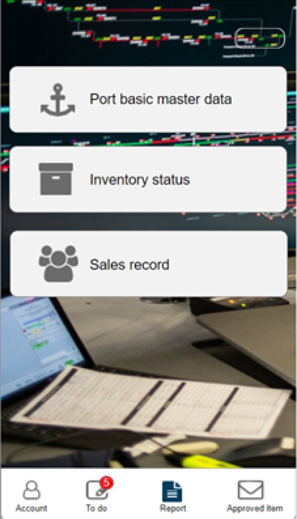
View products
Place orders
Get cargo release notification


Research
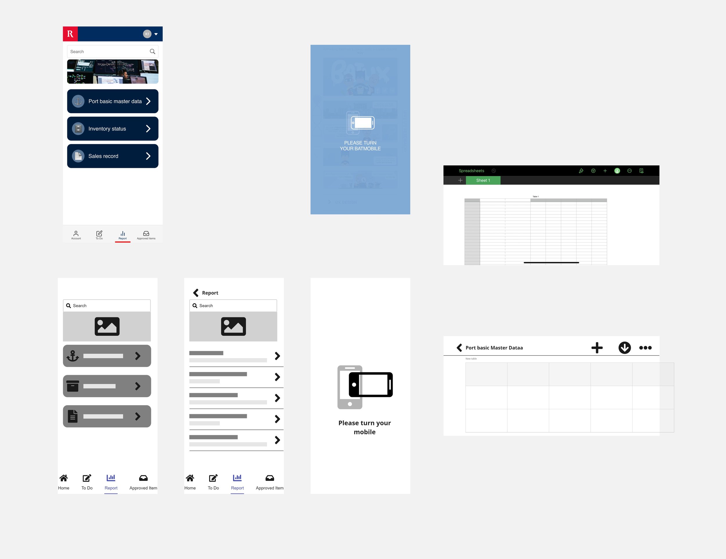
The research for this project became crucial once the WeChat MVP was established. The UI had initial standards from the WeChat Design System, creating a basic WeChat app. The primary task was to enhance the user-friendliness of the screens while adhering to the underlying architecture, achieved by integrating the newly developed Rio Tinto Design System.
Following the modification of screens, focus turned to the system's utilization. Given the prevalent use of mobile devices over desktops and laptops in China, the app needed to incorporate standard mobile functionalities like contextual search bars, copy-paste features, and screen rotation for displaying large charts, even in landscape mode.
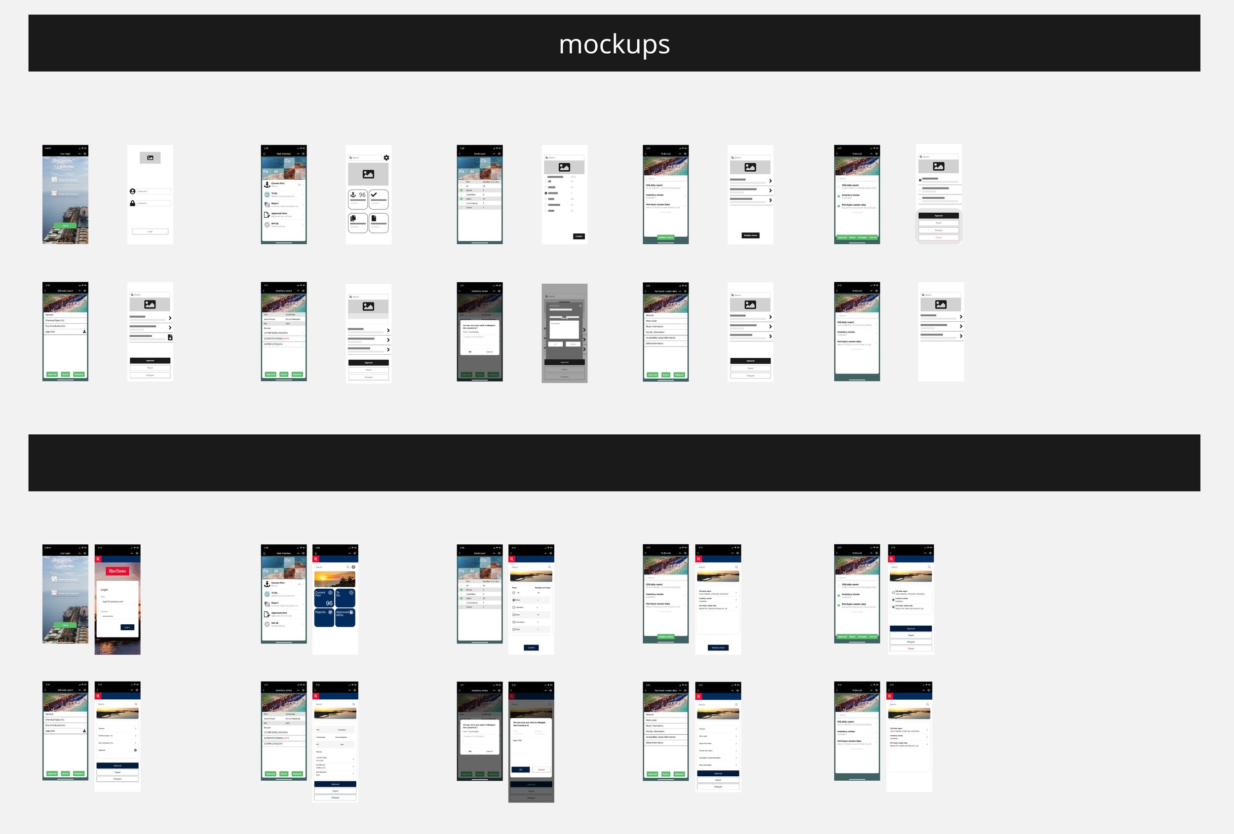


Refinements V1
Once the foundations of the app's architecture had been thoroughly tested and were starting to resemble a proper Rio Tinto product in the public domain, it became evident that elements of the design required refinement.
The process began with the adjustment of screen display locations, followed by the redesign of buttons, search placement, and hit areas like radio buttons, all tailored for the touch screen interface. Although the Rio Tinto Design system was functional, it continued to evolve, especially in adapting to touch screen technology. While touch screen elements were initially conceptualized, real-world testing provided valuable feedback that contributed to enhancing the designs.


Refinements V2
The benefit of WeChat apps lies in their lightweight design, ensuring fast loading times and seamless integration with the WeChat platform. To further enhance user experience, the focus shifted to optimizing screen loading times and improving navigational visibility within the app.
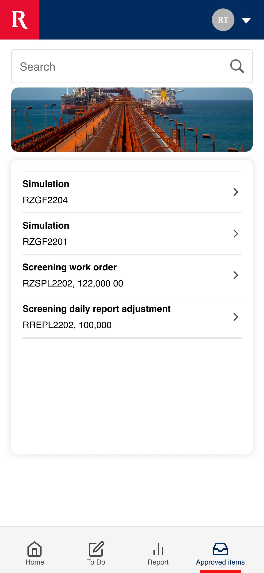
This led to the introduction of a bottom navigation bar, addressing previous challenges associated with standard WeChat navigation functions. Furthermore, enhancements were made to filters, dropdowns, popup copy, and feedback mechanisms, refining the overall app experience.


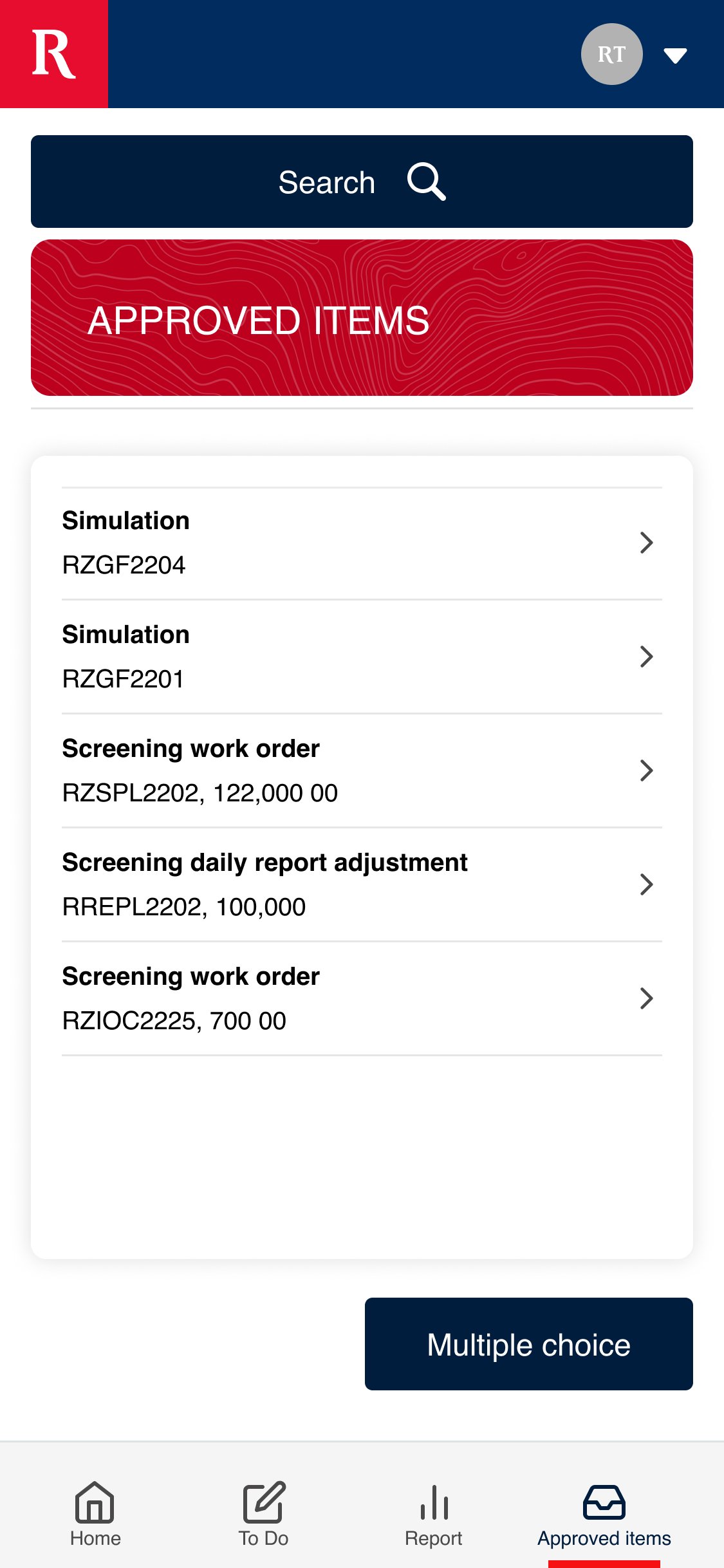
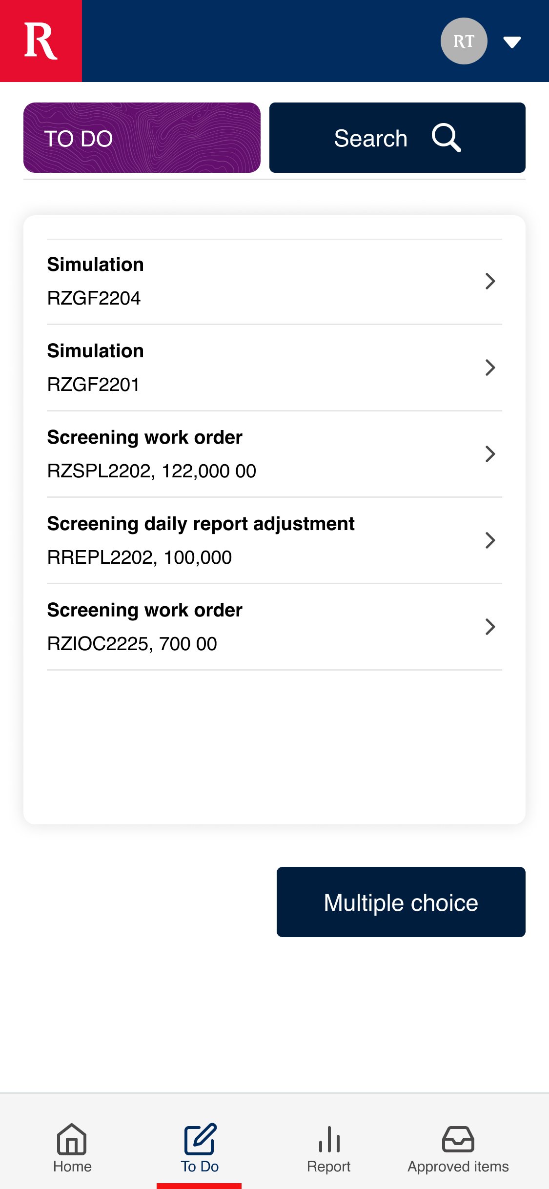
Report
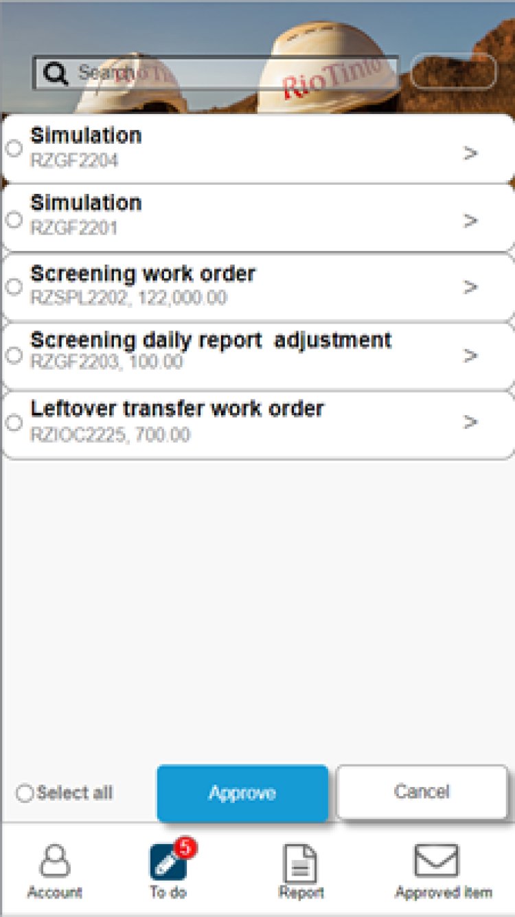
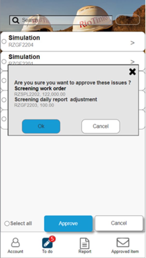
While the other sections of the app were more secondary in terms of time spent on screen, allowing users to review work to be done or delegate tasks, the Reports section was where users spent the majority of their time refining searches and viewing cargo release information. This involved utilizing the research and development of the Cards that were created in the CMD Portal. This concept was deployed and, as it was currently developed and integrated into the Design System Governance, it was easy to redeploy in this particular use case.


User Feedback
When conducting user feedback, we carefully examined three key areas to enhance the system:
User interviews
Heat mapping
A/B testing.
To understand the system's essential functionalities, I engaged with key users, gathering their insights on likes, dislikes, and potential improvements.
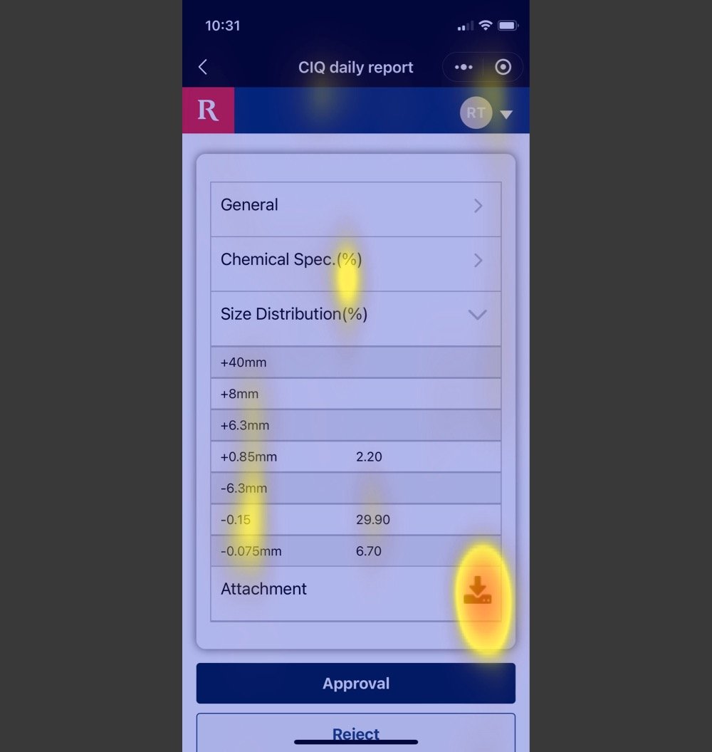
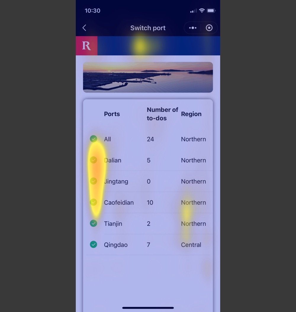
Heatmap software provided valuable insights by scrutinizing each screen for potential areas of concern, utilizing the standard Z & N scan method.
Additionally, A/B testing was employed to assess the impact of color-coding on different sections throughout the system, ensuring a comprehensive evaluation of user experience.
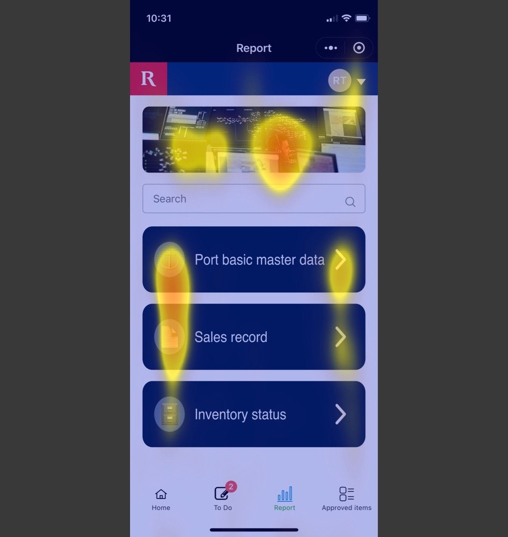


Color redesign
The A/B Testing provided important findings as users found this design to be most helpful. By color-coding each section, it allowed for better recognition rather than recall, enhancing the overall user experience and making navigation more intuitive. The results underscored the significance of visual cues in optimizing user interaction and engagement with the platform.