
Rio Tinto -
Polaris Portal
Polaris was is strategically designed to expand its capabilities in evaluating deals, nominations, and costs associated with the Aluminium Pacific Remelt business. This critical function is achieved through the comprehensive consideration of the following key features:
Features
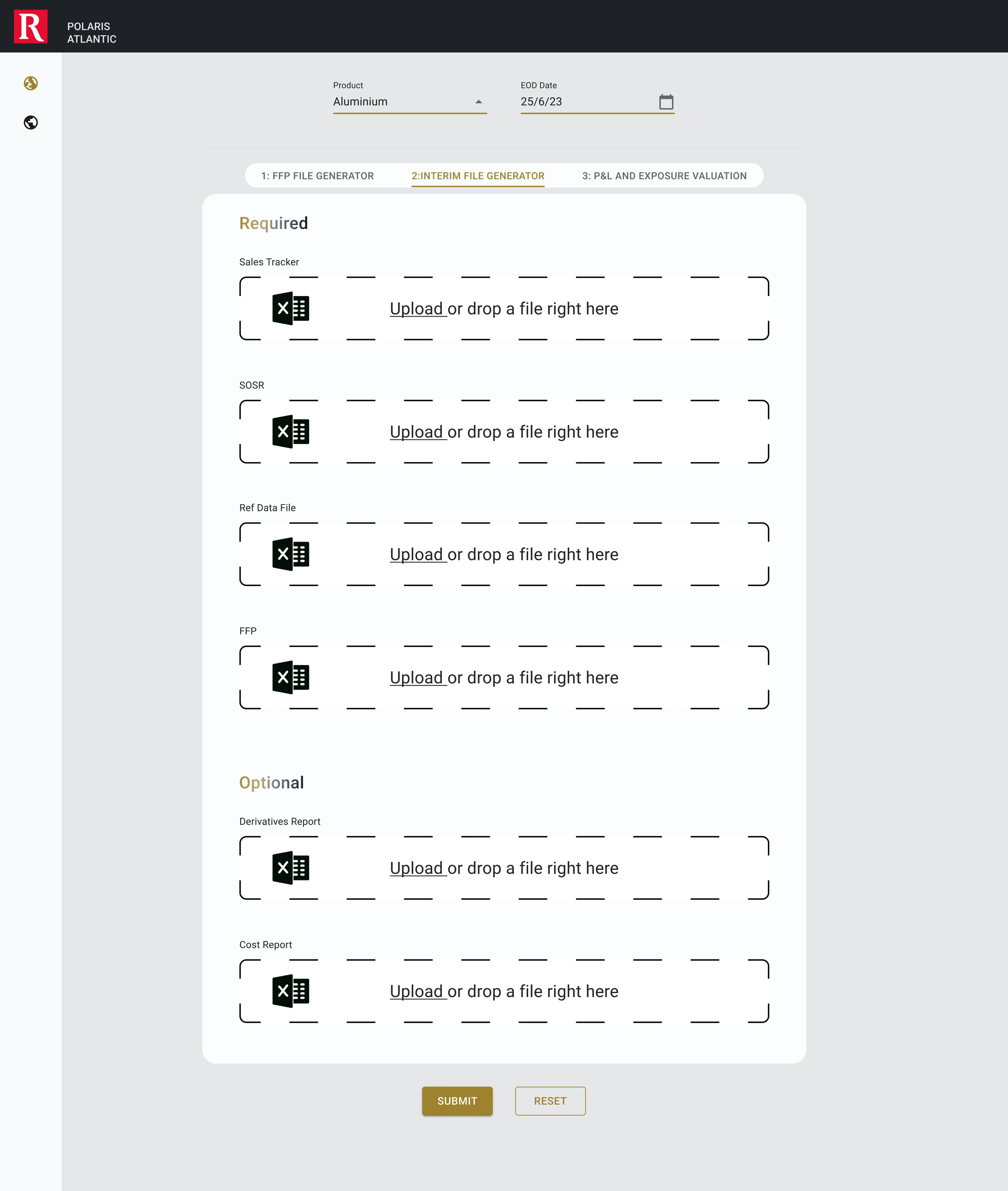
Extract sales information from Sales Tracker (Excel maintained by Sales\Portfolio Team in Aluminium Pacific BU) and generate forecast based on that
Extract nominations\actualised information from SOSR report from SAP and merge it with Sales forecast
Extract shipment cost from Shipment Cost report from SAP and merge it with nominations to get the actual costs
Extract the production data from Sales Tracker to generate sythentic purchases based on transfer price
Consume reference data to extract information like transfer price, MTM model, MTM override and estimated freight
Valuation engine
Research
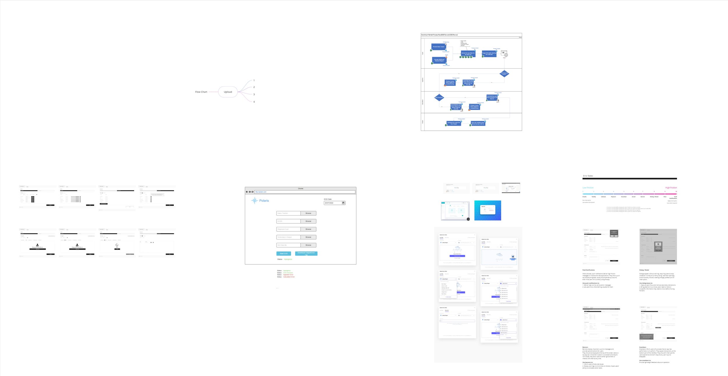
The research conducted involved a thorough examination, including user interviews, a heuristic evaluation, and direct observation of user interactions with the aid of embedded code and data collected on hotter of the current MVP to identify areas for improvement and gather feedback efficiently.
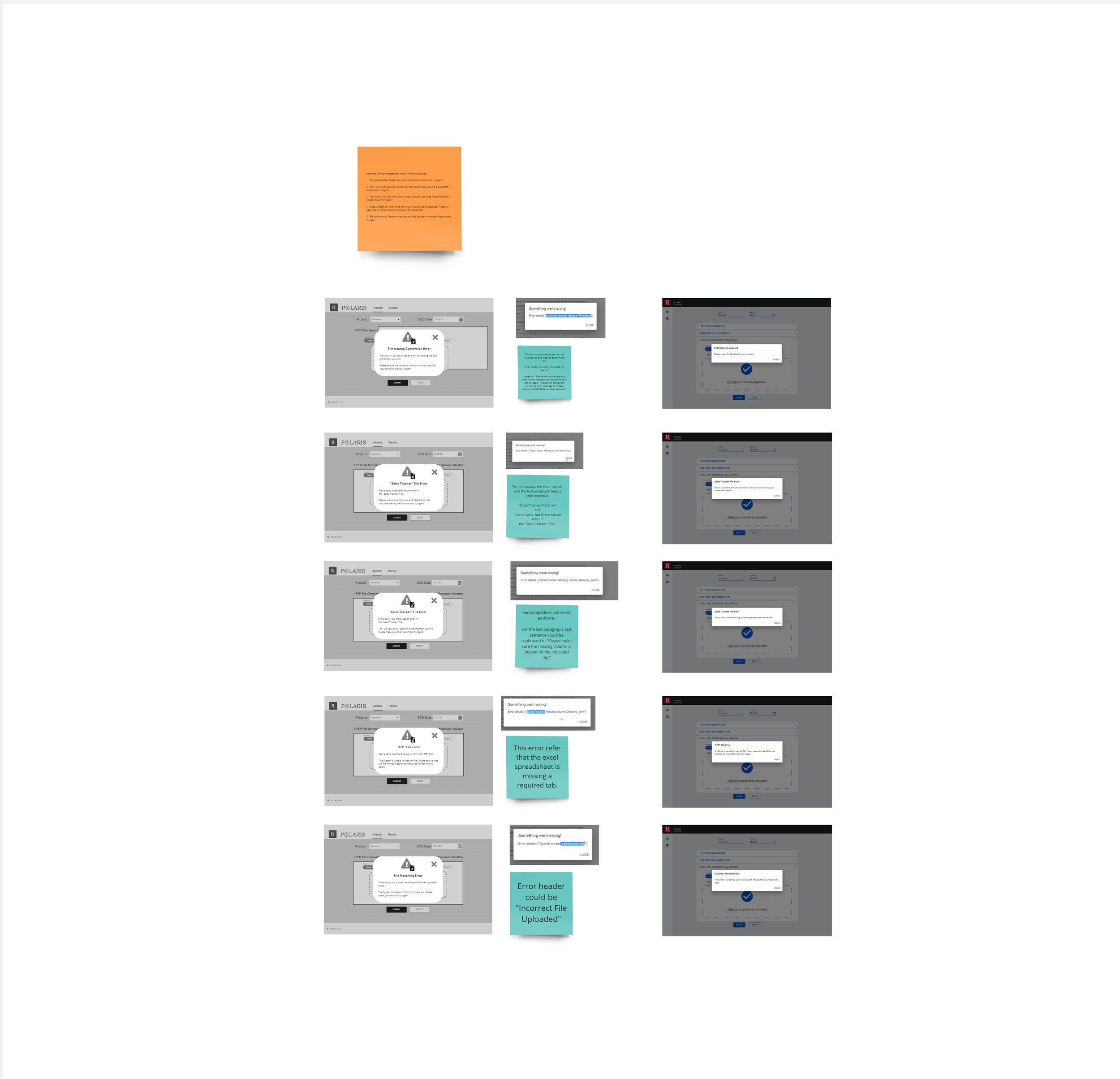
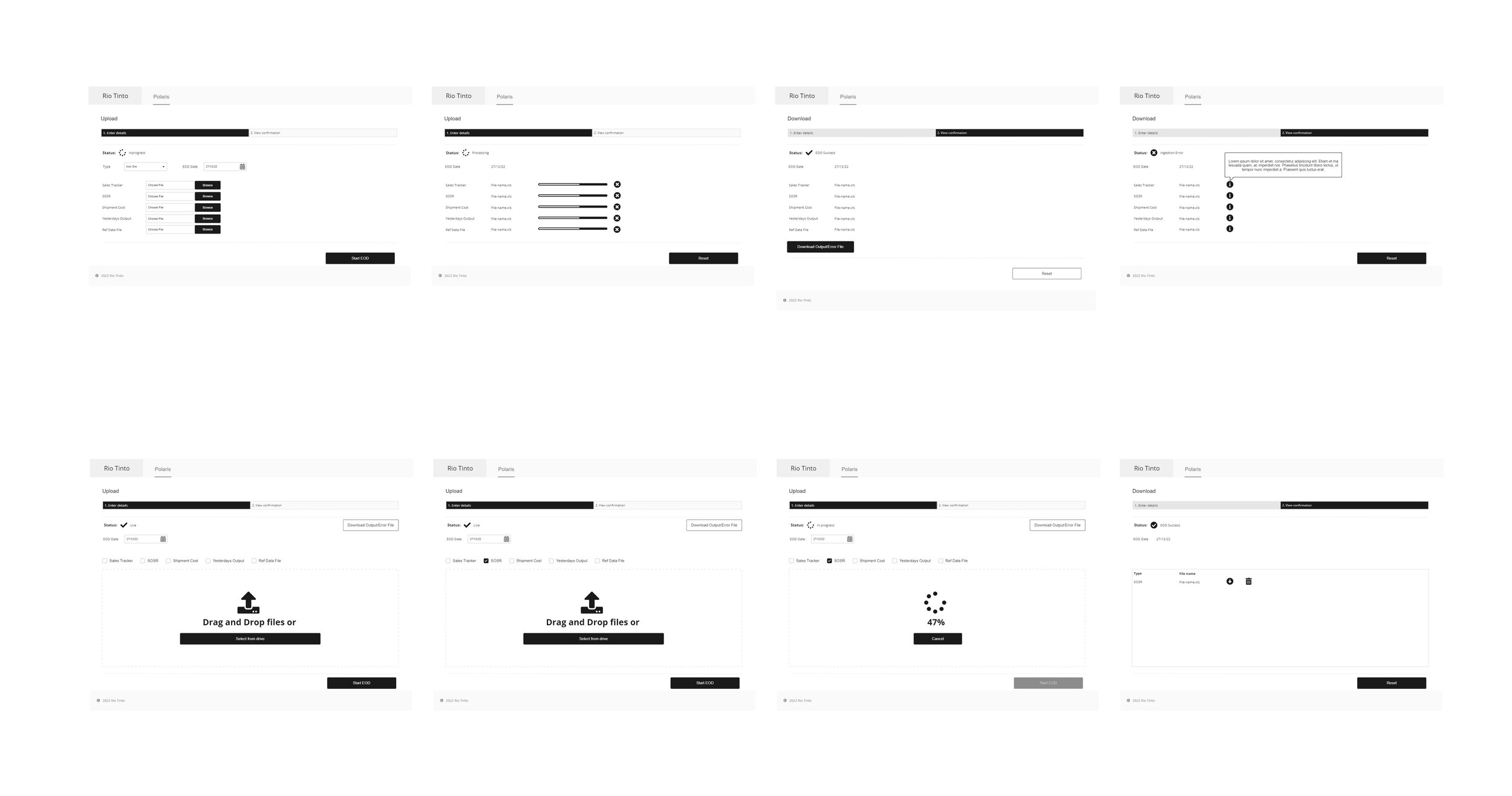
Analysis revealed that users struggled with the upload process, mainly due to extended processing times and ambiguous instructions regarding necessary uploads, leading to varied responses. Challenges arose from managing multiple zip file outputs, adding to user frustration. Moreover, the absence of a clear indication that the correct file generator had been selected caused uncertainty until post-generation confirmation.
Insights from the research guided the application of established UX principles such as the Peak-End Rule by addressing the peak & end of the upload and generate flow, Law of Similarity would be used when dealing with the similar upload elements in a design as they would be seen as a complete picture indicators and parsing would be used to break them up, and Law of Common Region to clearly defined boundary of all the file upload sections. Additionally, error statistics were classified based on friction levels, and tailored UX copy was developed to address common issues effectively.

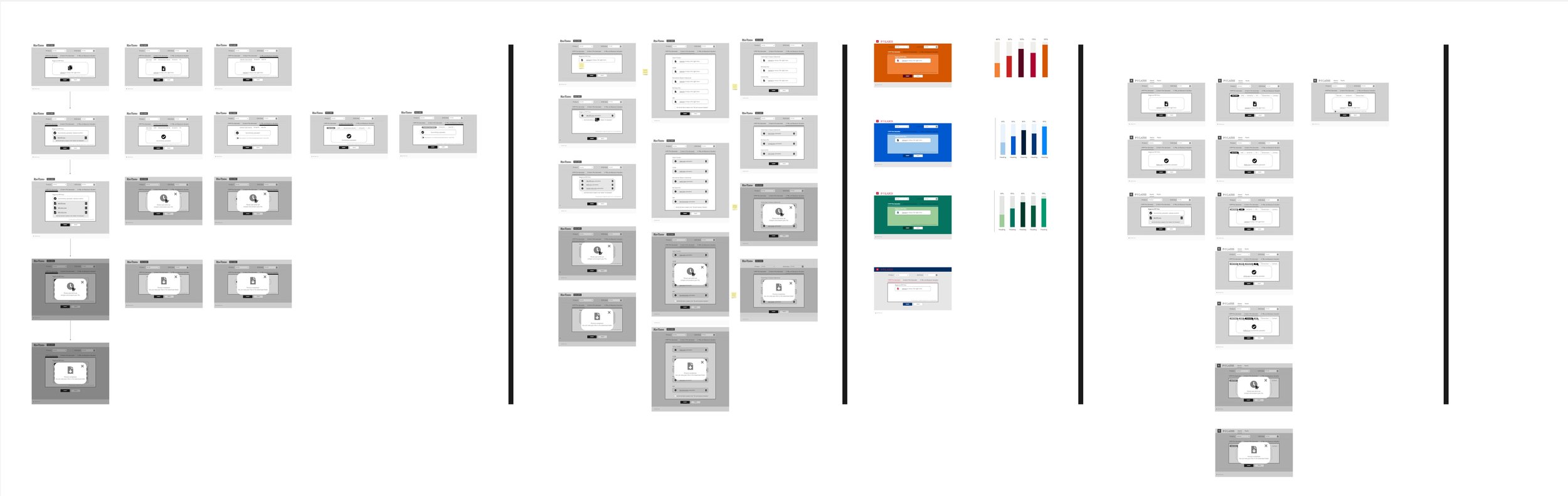
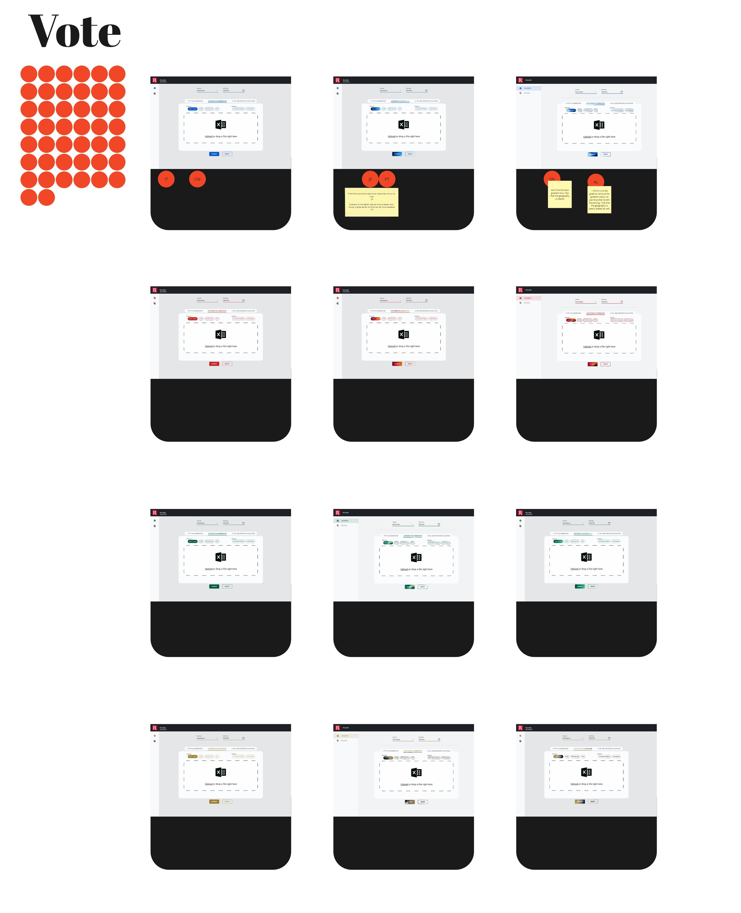
Design System evolution
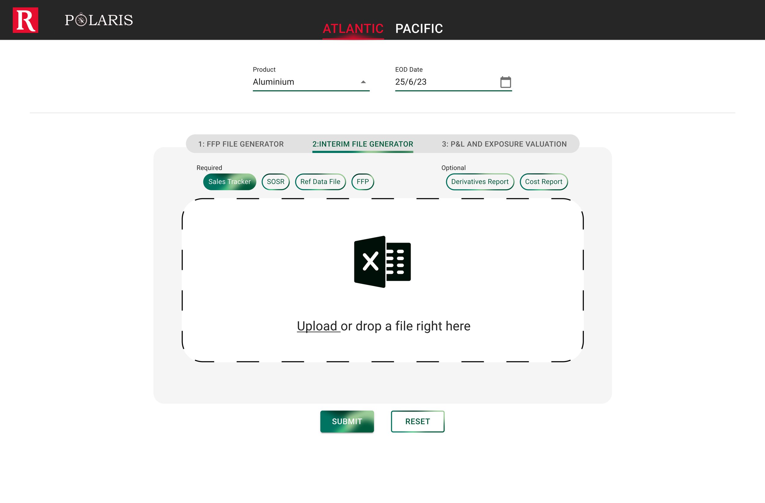
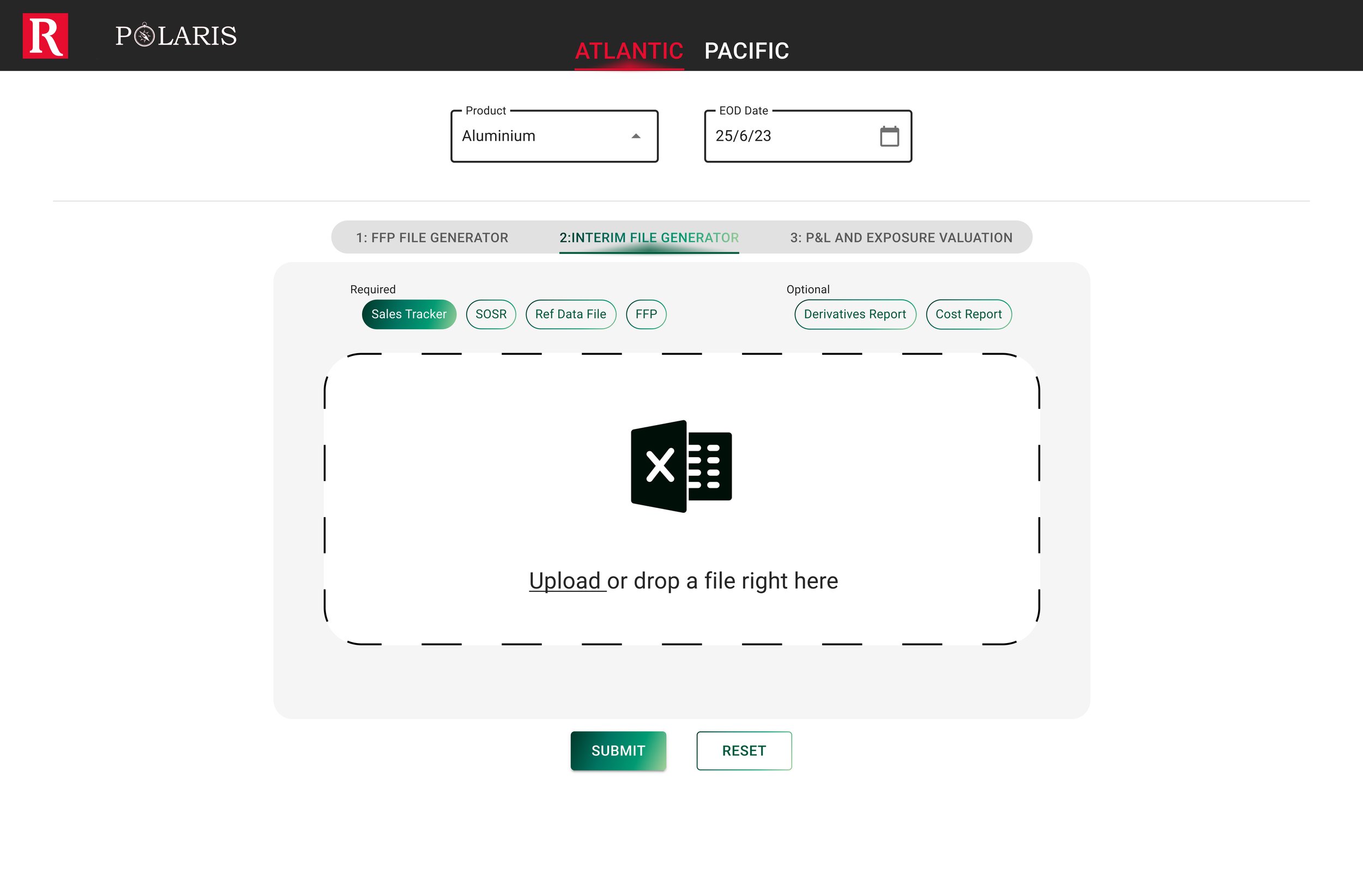
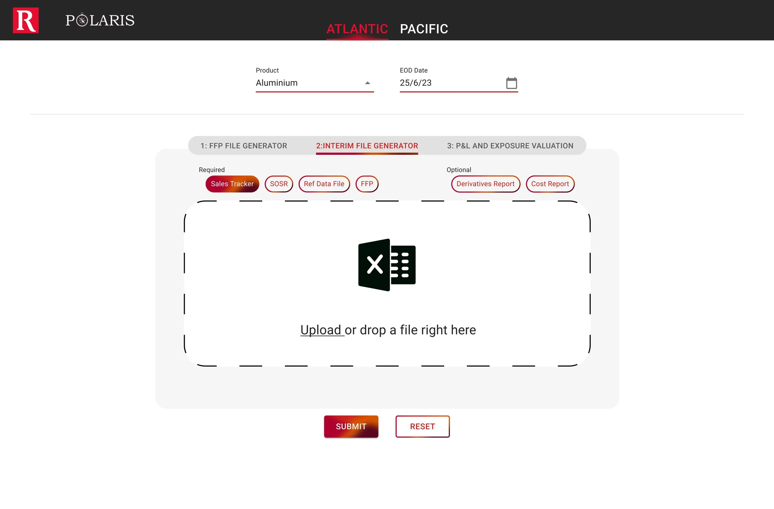
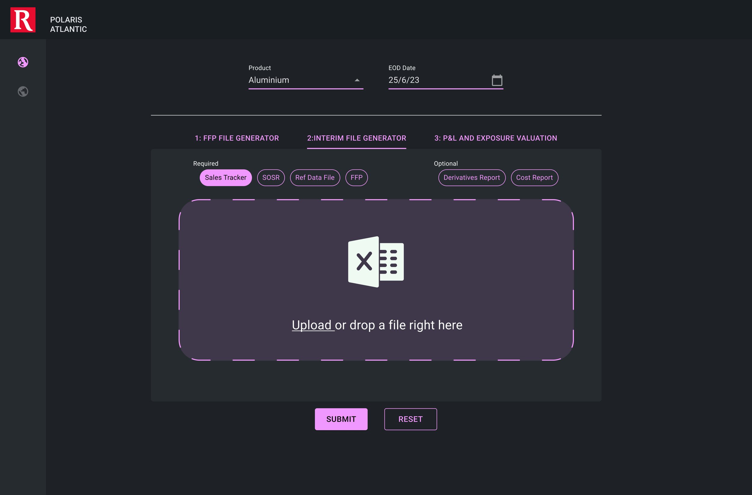
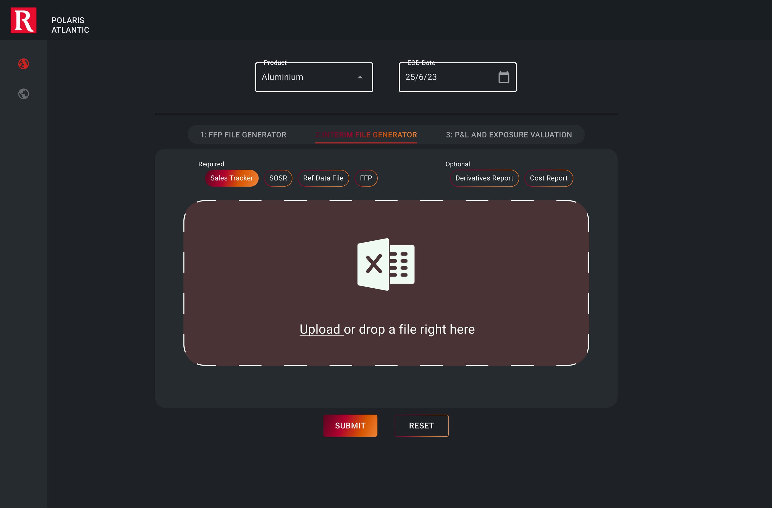
The initial version of the RT Design System was integrated into the system, and tests were conducted to establish a functional standard. However, acknowledging the nature of design systems to grow and adapt, the UI elements in the Polaris system were leveraged as a platform for experimentation.
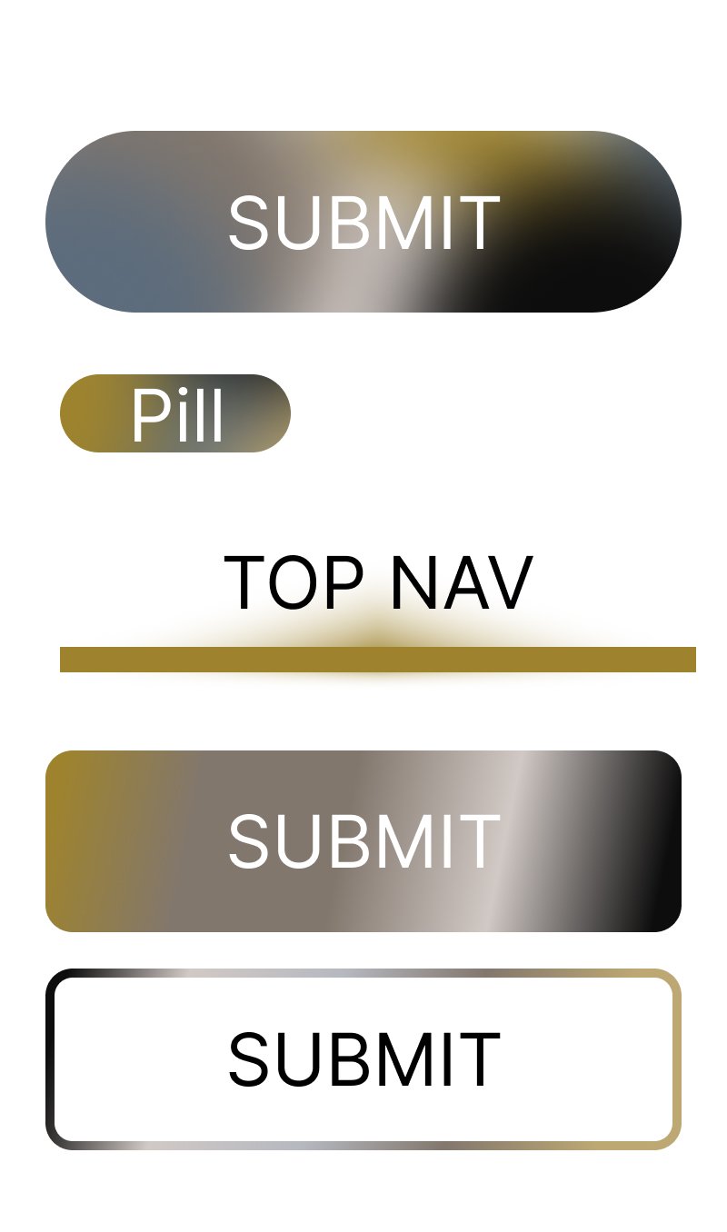
This allowed for the exploration of the updated RT branding guidelines, incorporating earthy tones, diverse color palettes, and varied textures. Several iterations of the core UI elements were developed to observe how these changes interacted with the overall system design.


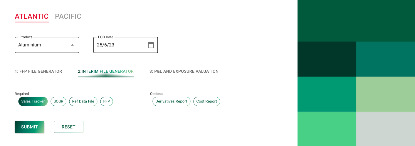


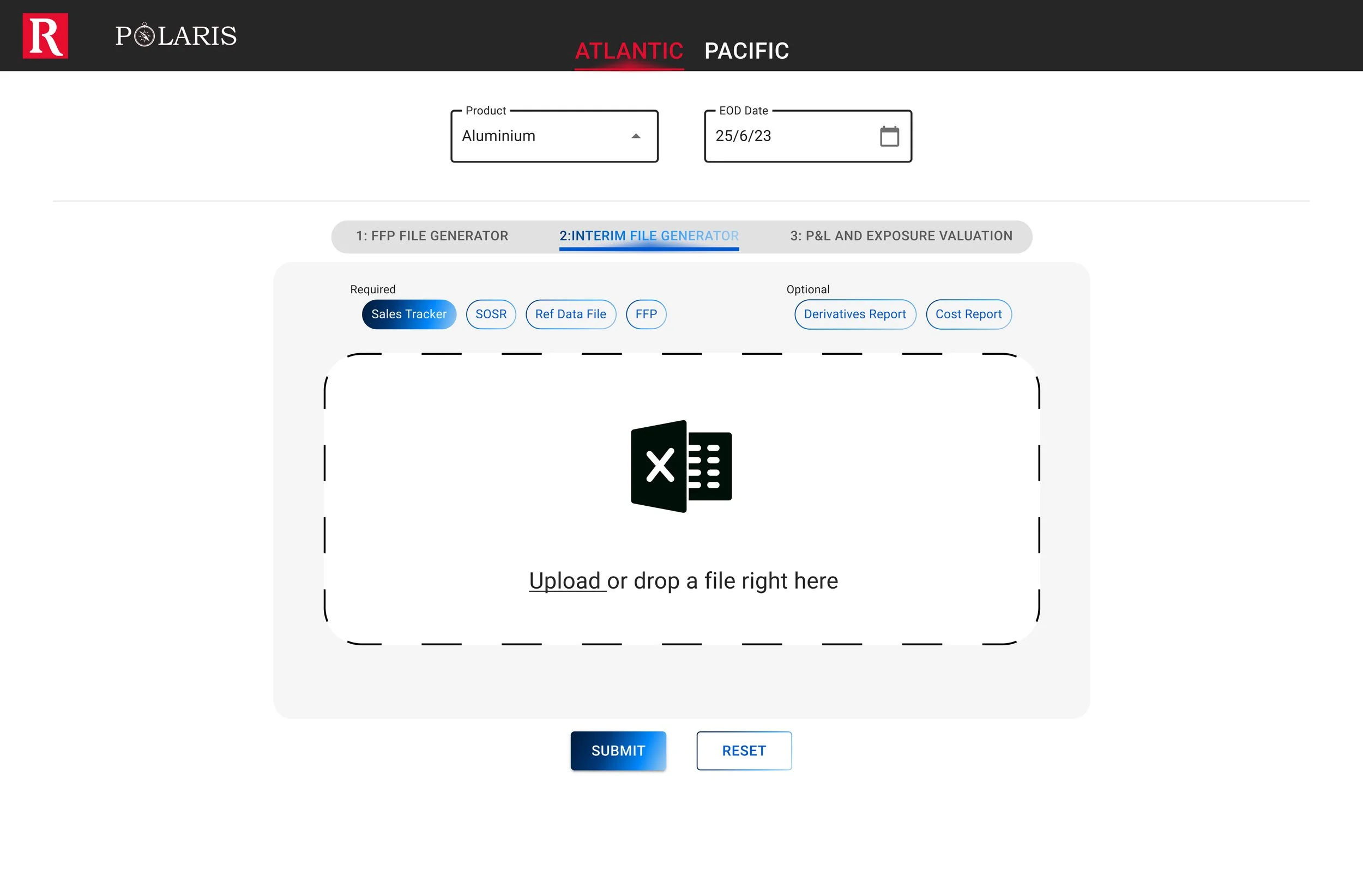
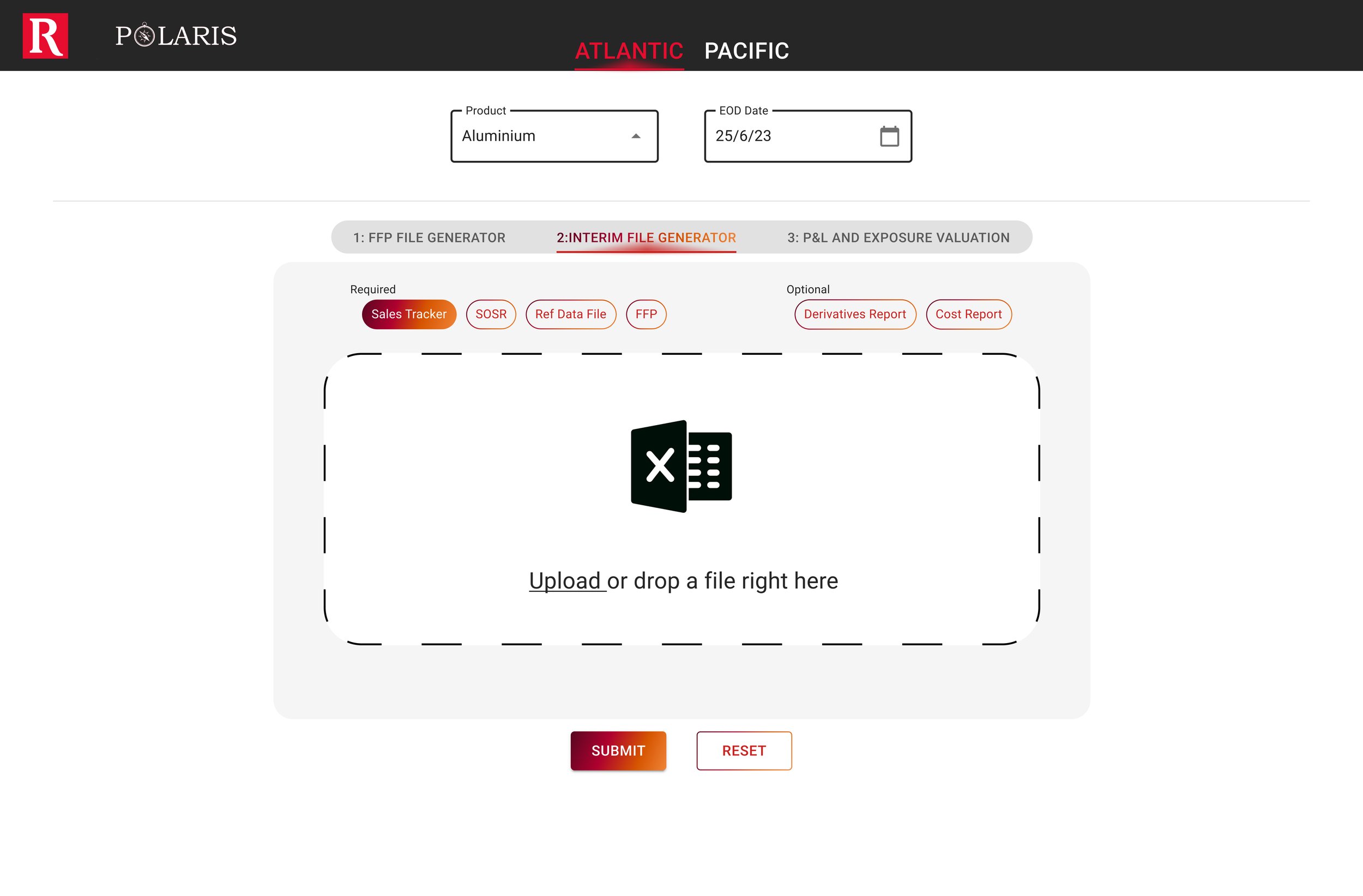
Fix the problems
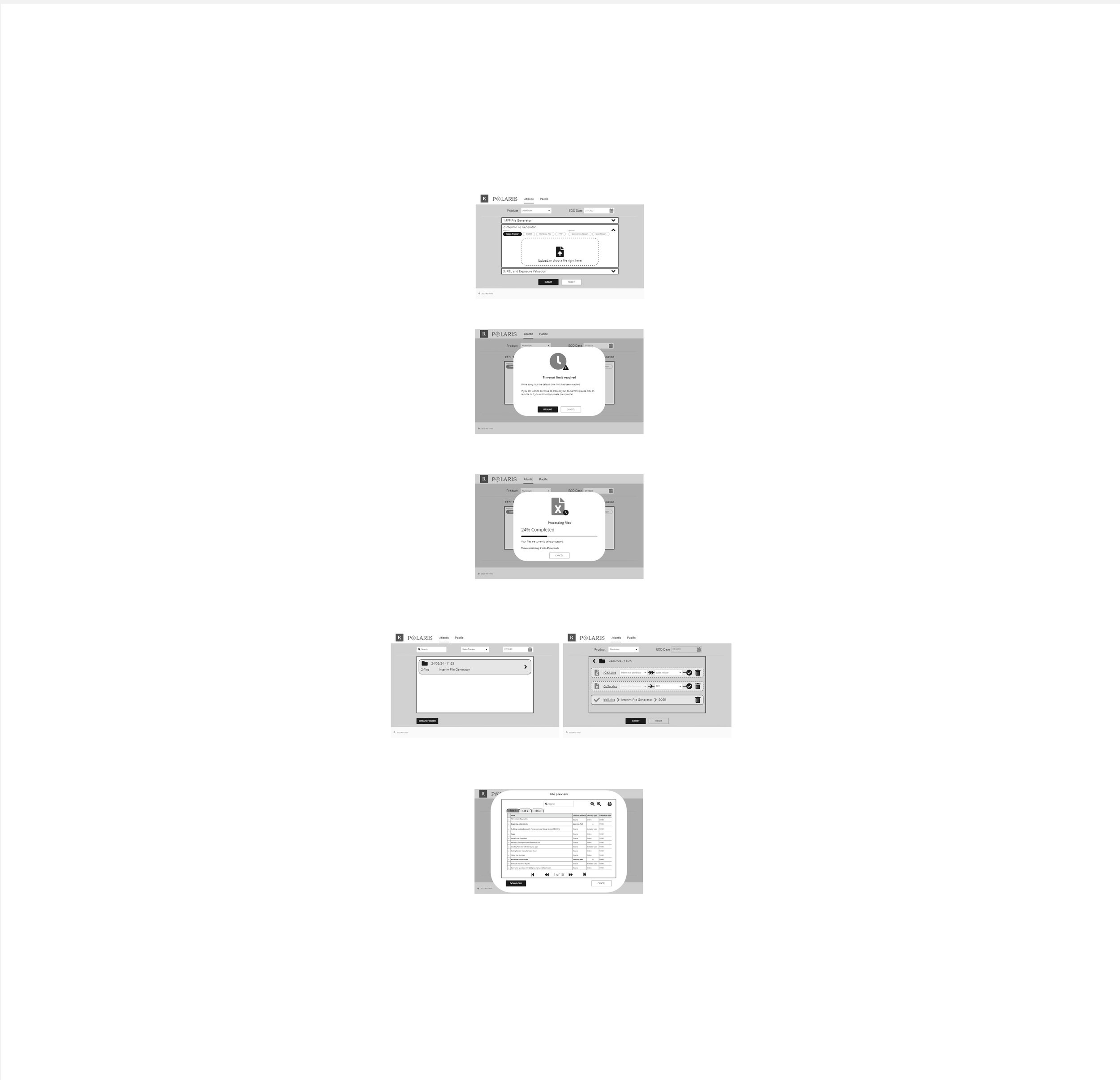
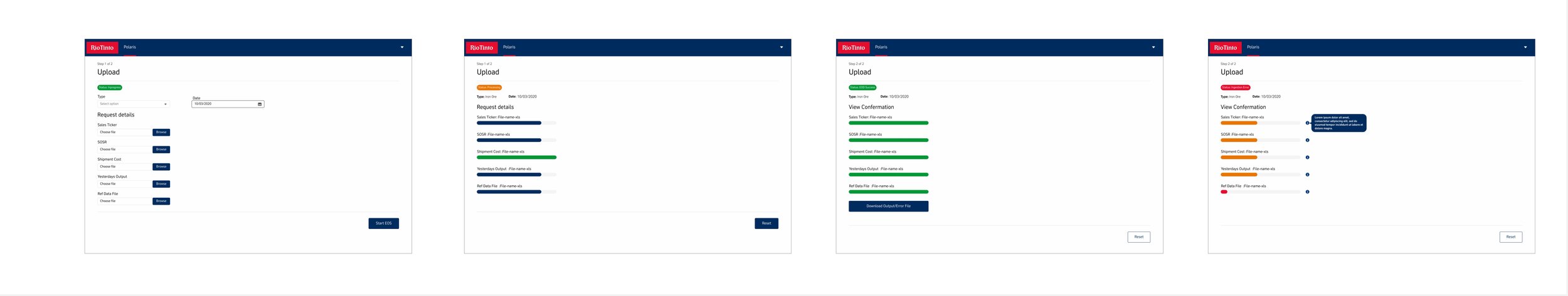
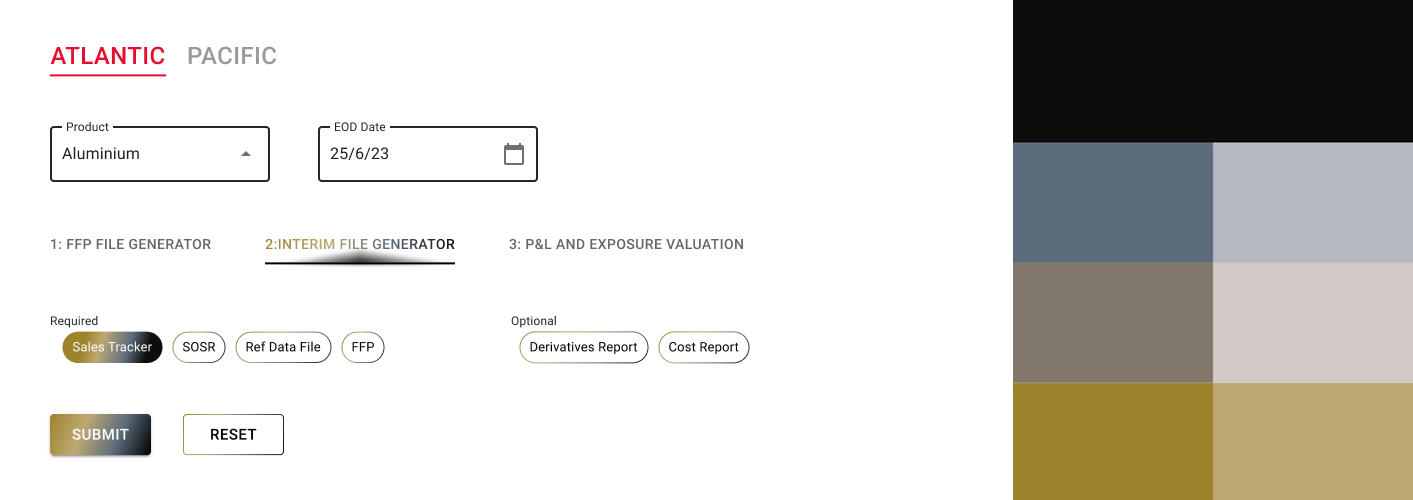
The first version of the new design emphasizes an expanded area that allows users to effortlessly drag and drop files. Additionally, error handling features have been integrated into dropdowns, offering users instant feedback if an incorrect product is selected. The file generators are now clearly categorized, distinguishing mandatory fields from optional ones through distinctive pill buttons. Significant enhancements have been made to ensure users can readily identify when the correct file generator is uploaded with the accurate file, eliminating any confusion or uncertainty during the subsequent generate action.


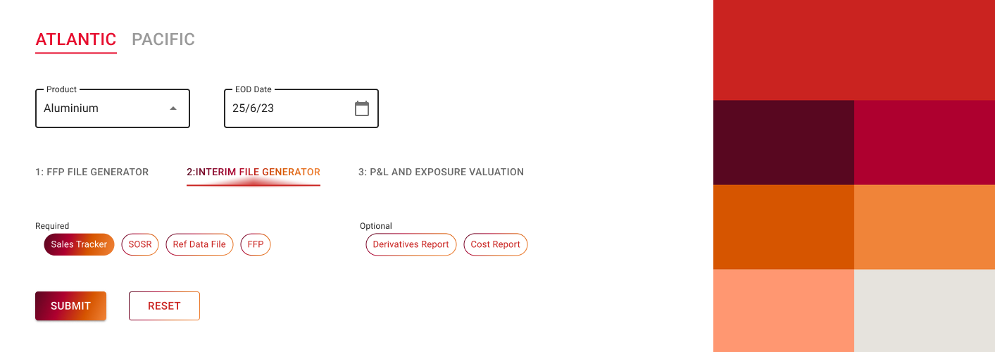
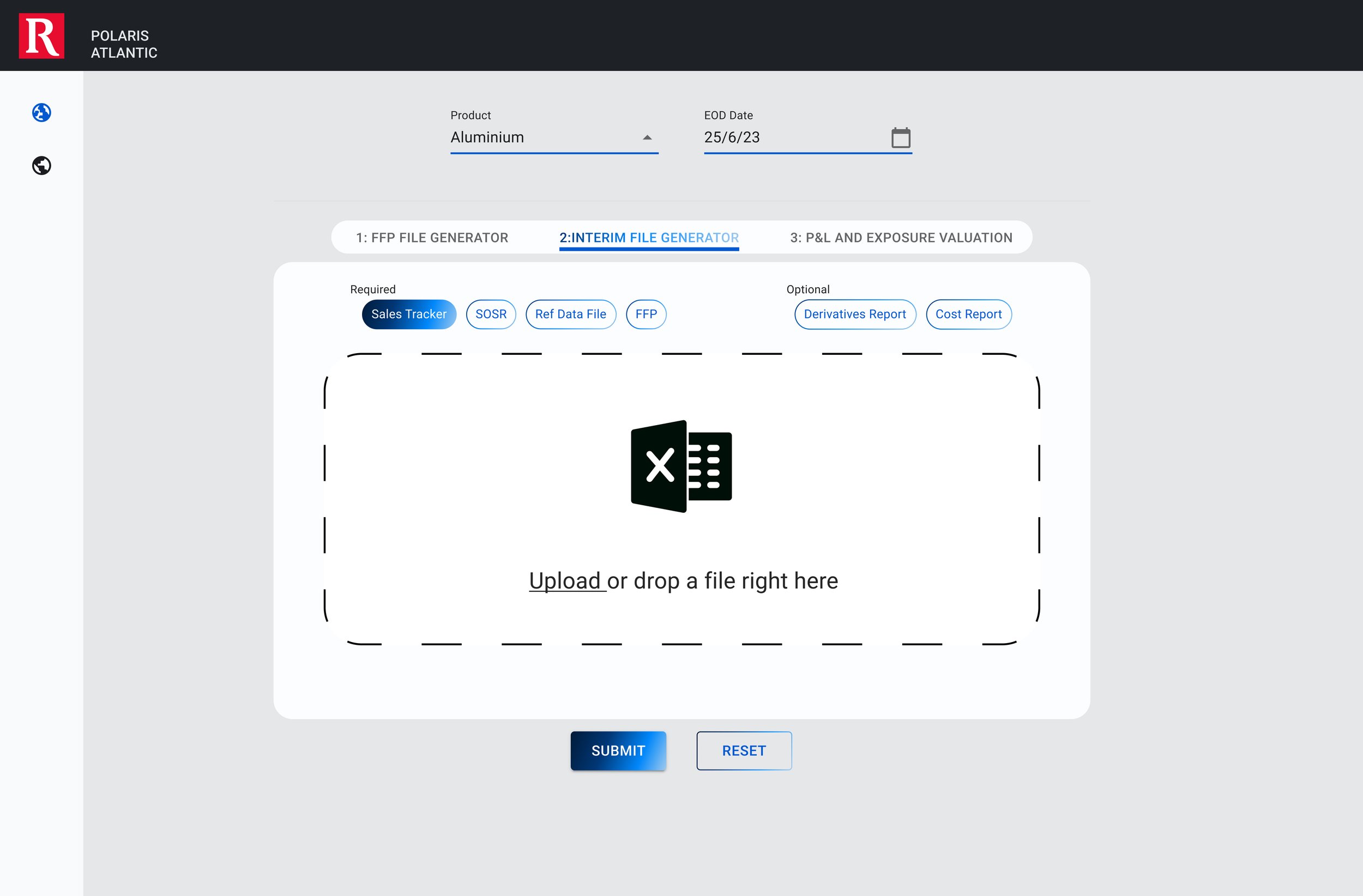
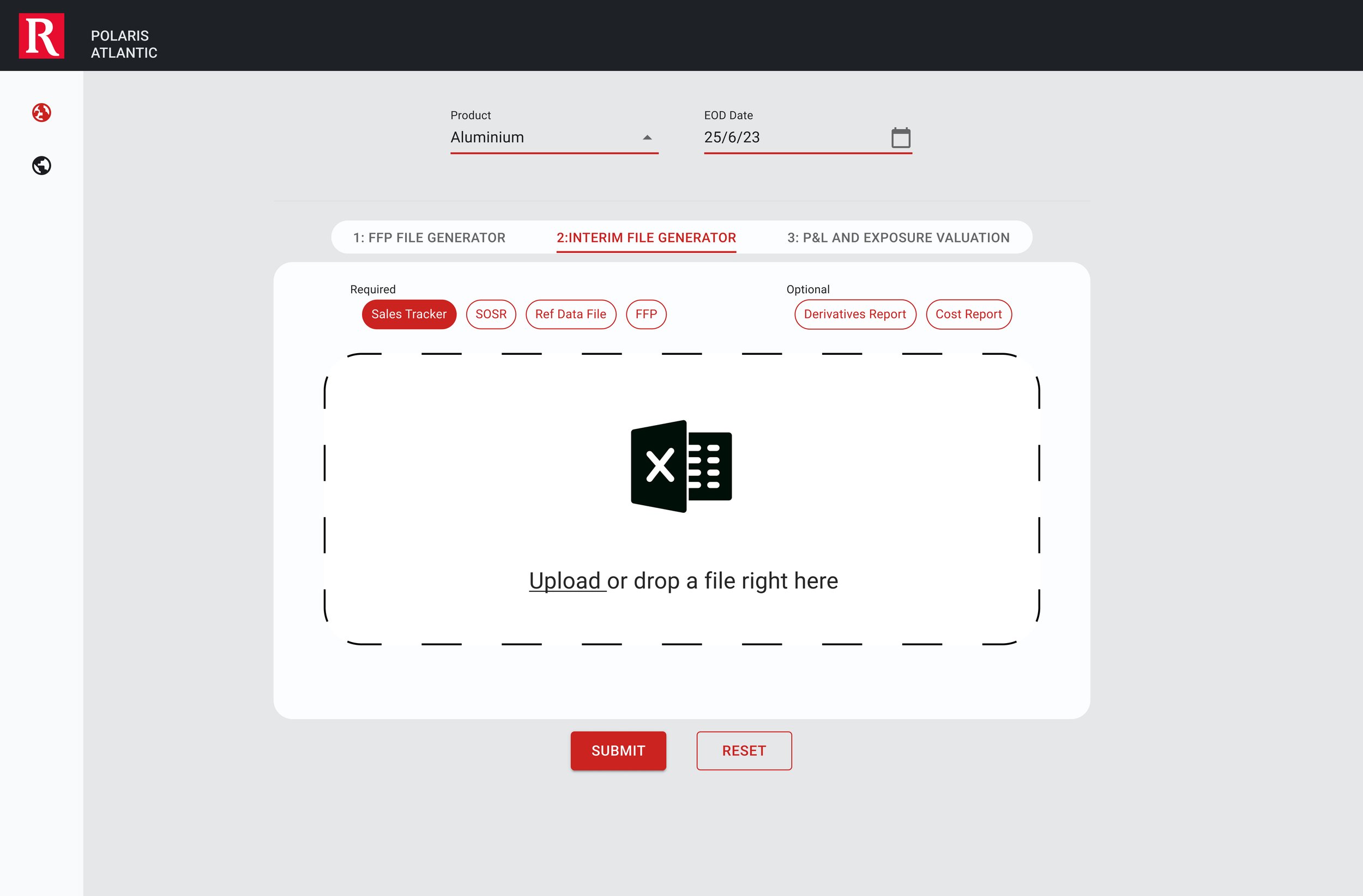
Working with the brand
At this stage of the development process, a cohesive design structure was slowly taking shape. User testing and feedback were instrumental in refining the positioning of elements. Moreover, cosmetic adjustments were underway to enhance user appeal. By harnessing the entire spectrum of the revised branding guide, various iterations of the system were meticulously explored for optimal effectiveness.


Future proffing
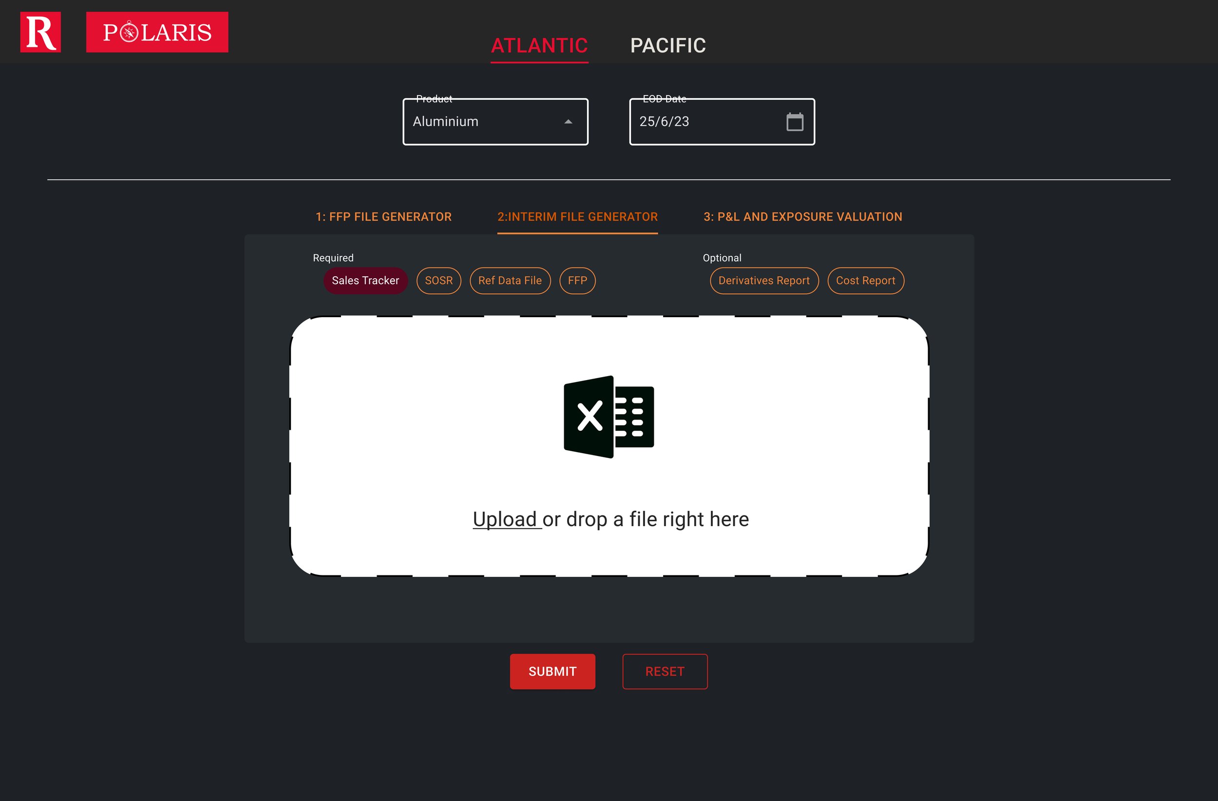
At this stage of the development, the team was pleased with the overall look and movement of the system. The conversation had shifted towards future-proofing and expanding to other regions, as the system currently functioned solely in the Pacific region. To enhance navigation, a left-hand ribbon was introduced, featuring icons and text. This design element enabled users to easily scan the page and maintain a clear sense of their location within the system. By utilizing heat mapping patterns from Z and F frameworks, this layout was intended to provide users with an active awareness of their position in the system.


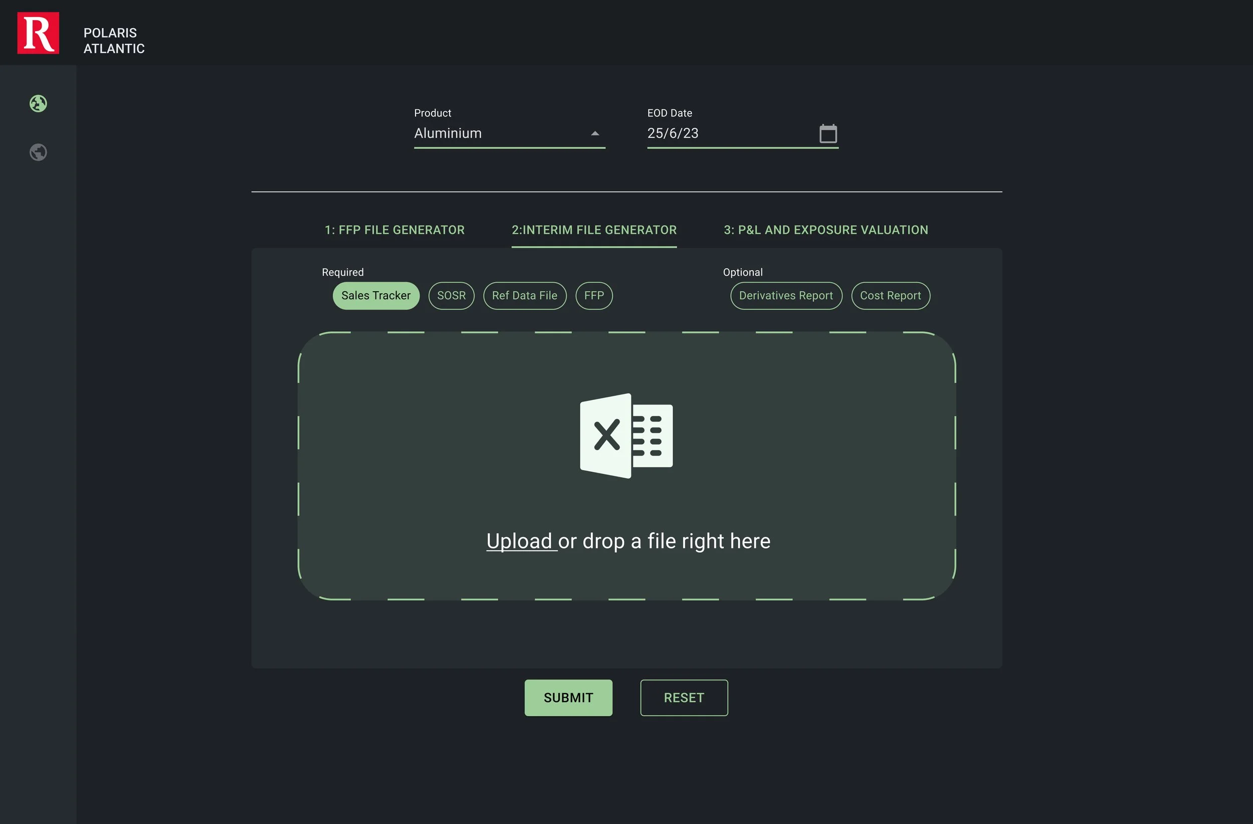
Dark Mode
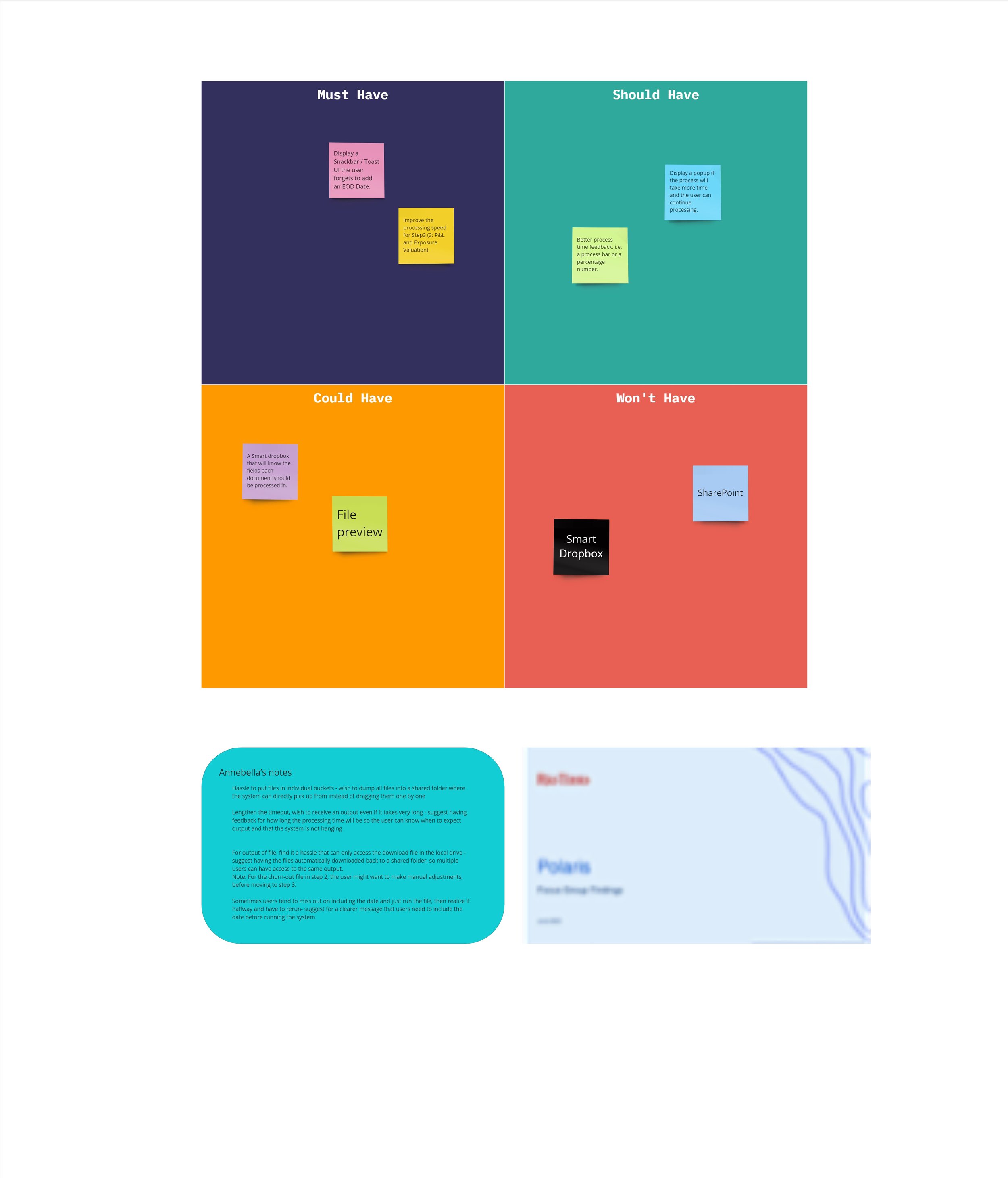
After conducting numerous rounds of user feedback and addressing the users' core requirements, we carefully examined the MoSCoW board created during user research to give teams a development roadmap to prioritize tasks and to also log users needs.
We decided to focus on implementing a quick fix to enable dark mode for users. Despite being a minor feature, its deployment sparked considerable user excitement. This seemingly simple visual enhancement proved to be a significant improvement for many users who often experience eye strain, resulting in a more positive experience with the Polaris system.


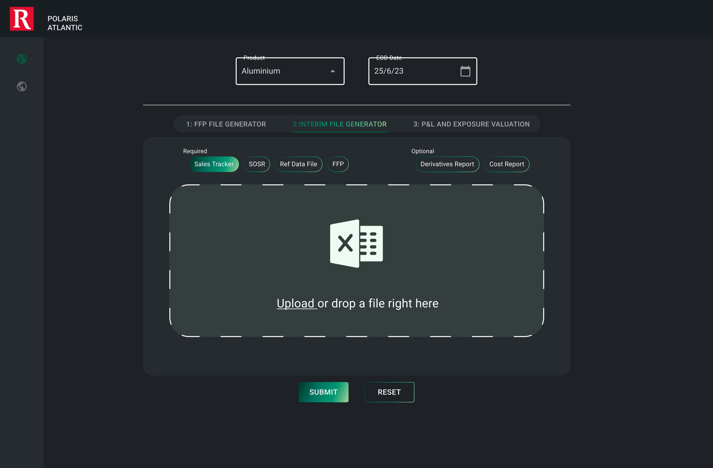


Full screen upload
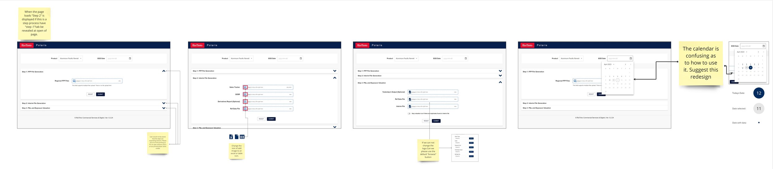
For some of our users, change is never good, so for this update, we revisited the MoSCoW board. We focused on addressing a legacy issue as the initial MVP of Polaris featured standard file upload boxes, a screen flow familiar to many users. This concept underwent a re-imagination to include larger upload boxes enabling seamless drag-and-drop uploading, coupled with textual feedback to indicate the status of file uploads.