
Rio Tinto
Design System
The Rio Tinto Design System became a need as the company's projects expanded in scope and complexity. With a growing array of products and services, there arose a demand for a cohesive framework that could ensure consistency and efficiency across all design endeavours. It was a methodology for designing digital products based on a hierarchy of complex components divided into stages, where a change at any stage will affects all subsequent ones. This system not only met the immediate requirements but also paved the way for future scalability and adaptability, becoming an integral part of Rio Tinto's design infrastructure.
The Design system was developed with the core intention of ensuring simplicity, familiarity, inclusivity, robustness, and momentum. These five guiding principles were meticulously crafted to lay the foundation for a user-centric approach, where every aspect of design revolves around ease of use, recognizability, accessibility, resilience, and forward-moving energy.
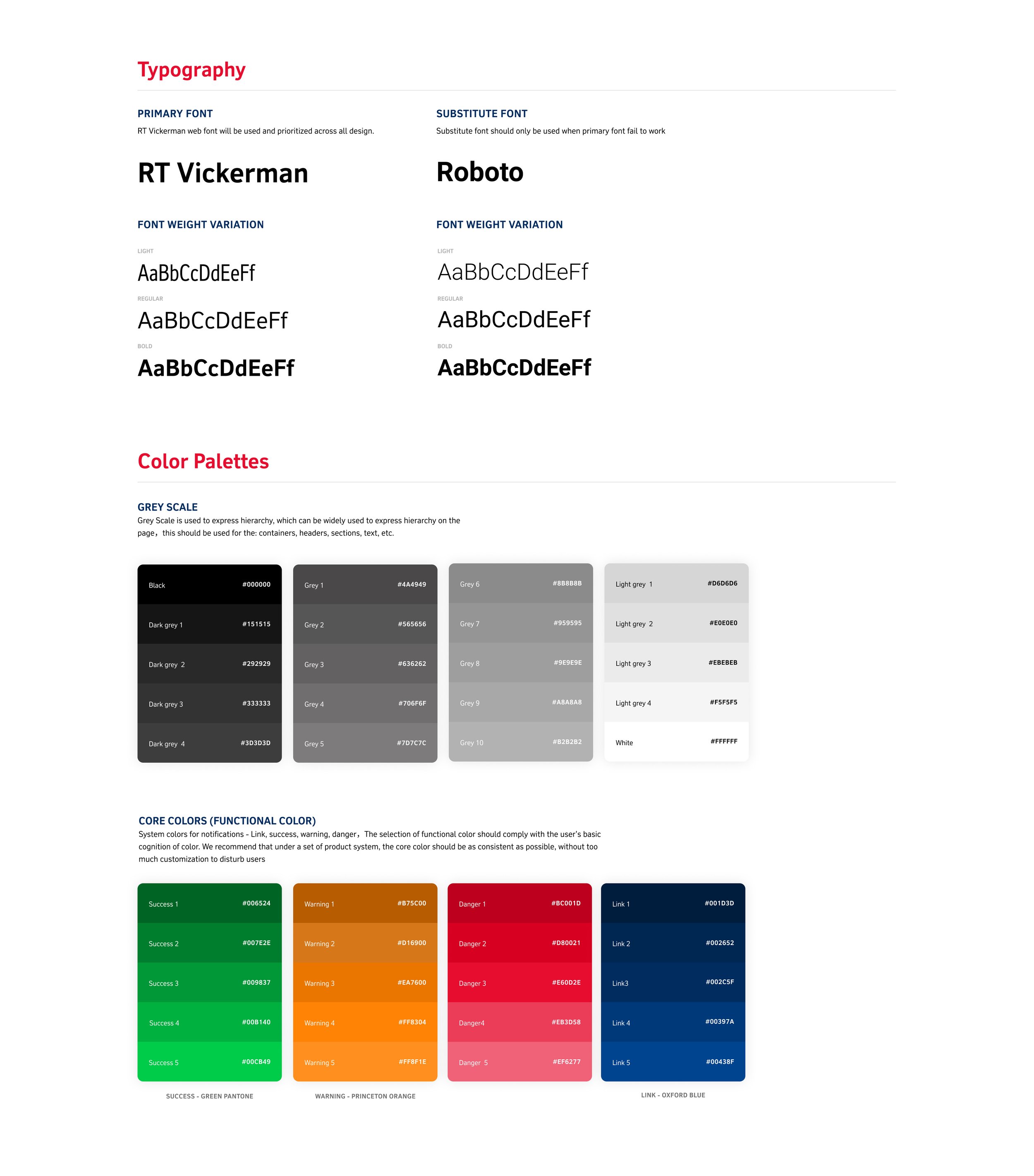
The Visual Language module comprehensively covered various crucial elements essential for effective design, including a detailed exploration of colors and their impact, the use of elevation to create depth and hierarchy, the importance of grids and spacing for structuring content, the role of icons in enhancing user experience, creating effective layout designs, optimizing the use of tables for data representation, and the significance of typography in conveying visual information.


Components
All the standard and UI components were meticulously created, with a keen focus on every detail to guarantee peak performance and effortless assimilation into the system, thereby establishing the bedrock of user interaction. Each component was exhaustively future-proofed, ensuring that they could function autonomously on diverse platforms, thus enabling effortless interlinking for unparalleled versatility. This adaptability empowers teams to leverage standard UI components to construct customized interfaces tailored to their unique project requirements.


Guidelines
After the core components had been carefully designed and developed, it was crucial to craft a comprehensive user guideline. This guide would enable teams to thoroughly review all the components and understand their optimal applications. The guideline also encompassed four essential standards, providing teams with clear insights into the appropriate utilization of each component.
When considering the appropriate circumstances for usage, it is crucial to determine the specific context in which the application is intended. Equally important is recognizing the situations in which it would be unsuitable or counterproductive to utilize the said application. Furthermore, understanding the expected behavioral norms and adhering to established writing guidelines are imperative for ensuring effective and professional communication.
![[1] Component_ Avatar.jpg](https://images.squarespace-cdn.com/content/v1/61f0ef99f0648e2b053fd97a/ce496de6-41a7-4cc6-8e25-0eec4283df78/%5B1%5D+Component_+Avatar.jpg)
![[2] Component_ Badge.jpg](https://images.squarespace-cdn.com/content/v1/61f0ef99f0648e2b053fd97a/5d8578dd-8f1e-4700-917b-387422b02565/%5B2%5D+Component_+Badge.jpg)
![[3] Component_ Breadcrumb.jpg](https://images.squarespace-cdn.com/content/v1/61f0ef99f0648e2b053fd97a/789b3b01-5b9f-42e9-be7b-227d67748814/%5B3%5D+Component_+Breadcrumb.jpg)
![[4] Component_ Button.jpg](https://images.squarespace-cdn.com/content/v1/61f0ef99f0648e2b053fd97a/07828bfa-7fa3-49ae-b99c-29e87528d614/%5B4%5D+Component_+Button.jpg)
![[5] Component_ Calendar.jpg](https://images.squarespace-cdn.com/content/v1/61f0ef99f0648e2b053fd97a/3f07ea53-6054-49e2-a779-aed5ea01f463/%5B5%5D+Component_+Calendar.jpg)
![[6] Component_ Dialog.jpg](https://images.squarespace-cdn.com/content/v1/61f0ef99f0648e2b053fd97a/86b99813-bb53-442c-b4d5-7ad225eaebf9/%5B6%5D+Component_+Dialog.jpg)
![[7] Component_ Dropdown.jpg](https://images.squarespace-cdn.com/content/v1/61f0ef99f0648e2b053fd97a/daadc587-9315-4304-bf02-80bc669f2288/%5B7%5D+Component_+Dropdown.jpg)
![[8] Component_ Form Input.jpg](https://images.squarespace-cdn.com/content/v1/61f0ef99f0648e2b053fd97a/f1484096-a43c-4e49-b1d1-2d1fb9e65e8e/%5B8%5D+Component_+Form+Input.jpg)
![[9] Component_ List & Tree.jpg](https://images.squarespace-cdn.com/content/v1/61f0ef99f0648e2b053fd97a/54706d8d-1782-4e7e-a09e-9b248ec4765b/%5B9%5D+Component_+List+%26+Tree.jpg)
![[10] Component_ Navigation.jpg](https://images.squarespace-cdn.com/content/v1/61f0ef99f0648e2b053fd97a/e5367157-6e78-4ba4-892c-a87dd408ac86/%5B10%5D+Component_+Navigation.jpg)
![[11] Component_ Progress Bar.jpg](https://images.squarespace-cdn.com/content/v1/61f0ef99f0648e2b053fd97a/ca84382e-160c-41e9-8c36-6f6a2d447ffa/%5B11%5D+Component_+Progress+Bar.jpg)
![[12] Component_ Checkbox.jpg](https://images.squarespace-cdn.com/content/v1/61f0ef99f0648e2b053fd97a/9d452346-be79-4b0c-a69d-d7e4a701df6a/%5B12%5D+Component_+Checkbox.jpg)
![[13] Component_ Choice Chip.jpg](https://images.squarespace-cdn.com/content/v1/61f0ef99f0648e2b053fd97a/720c48de-837b-49b7-b430-ff263e96de1e/%5B13%5D+Component_+Choice+Chip.jpg)
![[14] Component_ Radio Button.jpg](https://images.squarespace-cdn.com/content/v1/61f0ef99f0648e2b053fd97a/b74a76f5-1e35-4c56-9386-82ff6b2e391e/%5B14%5D+Component_+Radio+Button.jpg)
![[15] Component_ Slider.jpg](https://images.squarespace-cdn.com/content/v1/61f0ef99f0648e2b053fd97a/052f8e0d-c136-47da-b72e-025d6d21bca9/%5B15%5D+Component_+Slider.jpg)
![[16] Component_ Switch.jpg](https://images.squarespace-cdn.com/content/v1/61f0ef99f0648e2b053fd97a/29e4aac5-bec7-461b-8315-f0f36cfb5c15/%5B16%5D+Component_+Switch.jpg)
![[17] Component_ Spinner.jpg](https://images.squarespace-cdn.com/content/v1/61f0ef99f0648e2b053fd97a/ecddfae0-331a-468a-8771-5106a25eeca6/%5B17%5D+Component_+Spinner.jpg)
![[18] Component_ Steps.jpg](https://images.squarespace-cdn.com/content/v1/61f0ef99f0648e2b053fd97a/2af485e6-8767-462e-8078-516b4a6d2e07/%5B18%5D+Component_+Steps.jpg)
![[19] Component_ Status Indicator.jpg](https://images.squarespace-cdn.com/content/v1/61f0ef99f0648e2b053fd97a/cf4c68fc-0ddd-4848-99f4-c442c102047d/%5B19%5D+Component_+Status+Indicator.jpg)
![[20] Component_ Table.jpg](https://images.squarespace-cdn.com/content/v1/61f0ef99f0648e2b053fd97a/762cce9c-6ca0-4069-a99a-e8daa19a306f/%5B20%5D+Component_+Table.jpg)
![[21] Component_ Tabs.jpg](https://images.squarespace-cdn.com/content/v1/61f0ef99f0648e2b053fd97a/54beadce-1d69-43a9-ae28-fae035581037/%5B21%5D+Component_+Tabs.jpg)
![[22] Component_ Tag.jpg](https://images.squarespace-cdn.com/content/v1/61f0ef99f0648e2b053fd97a/ddd62c14-c5de-486b-abee-df3b86eb58b5/%5B22%5D+Component_+Tag.jpg)
![[23] Component_ Timeline.jpg](https://images.squarespace-cdn.com/content/v1/61f0ef99f0648e2b053fd97a/8361cefb-445f-4885-a1d8-77ddcb553c09/%5B23%5D+Component_+Timeline.jpg)
![[24] Component_ Toast.jpg](https://images.squarespace-cdn.com/content/v1/61f0ef99f0648e2b053fd97a/b781960b-1f7f-45f9-bea2-2a19ff0f23c6/%5B24%5D+Component_+Toast.jpg)
![[25] Component_ Tooltip.jpg](https://images.squarespace-cdn.com/content/v1/61f0ef99f0648e2b053fd97a/ab4a1b25-6061-4d9d-a3d2-a7f85c2d03e5/%5B25%5D+Component_+Tooltip.jpg)
UI Starter Kit
After the Design System was launched, comprehensive research was conducted to gather feedback from the teams regarding its effectiveness and usability. While the dev and UI teams found the Design System adequate, it was noted that product managers encountered challenges due to its extensive and complex nature. Consequently, the UI Starter Kit was developed as a streamlined version of the design system specifically tailored for product managers. This enabled them to efficiently review and initiate projects, facilitating rapid mockups and subsequent collaborative review with UX designers for further design refinement.


