
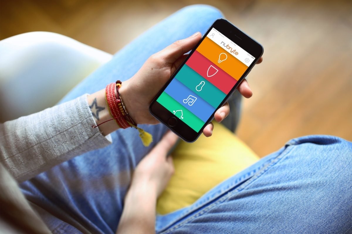
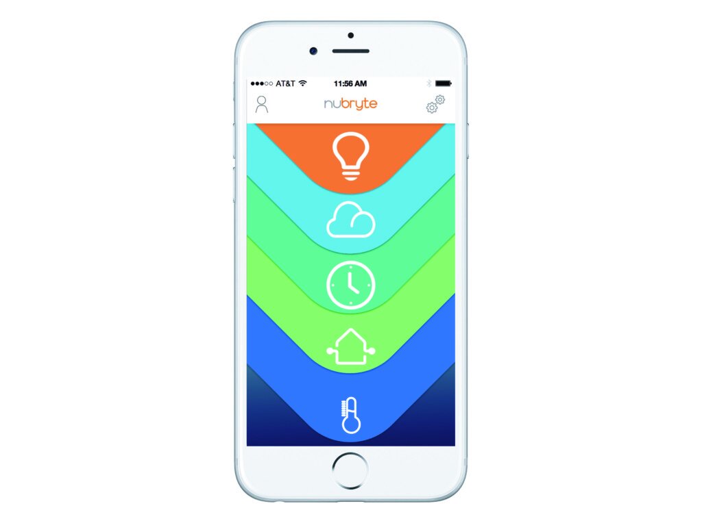
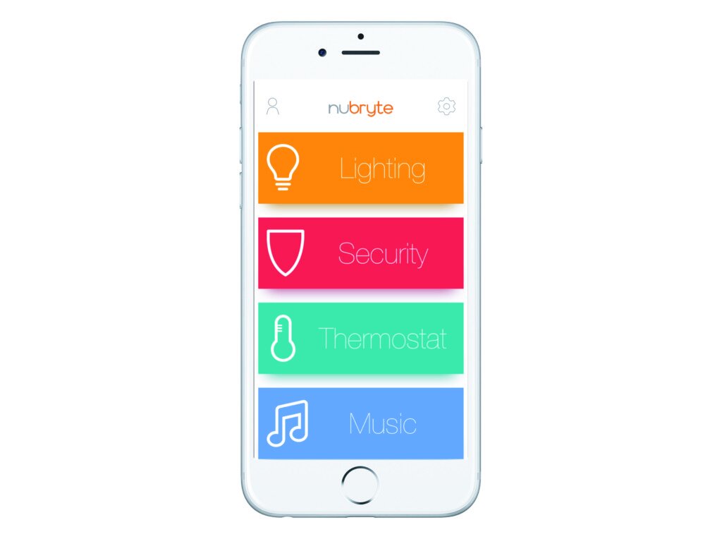
Nubryte App
We are often faced with a paradox when we design. A good looking App is becoming a less important way for brands to express themselves distinctively, compared to the value of a coherent, intuitive multi-platform user experience that communicates brand values through every touchpoint. For the redesign of the Nubryte App, we continue to refine that experience, blurring the boundaries between the two devices. While the first gen App and Panel Mirrored each function that could be carried out. The issue was that some screen flows worked better on the panel then app and visa versa. A whole new structure that is coherent across the entire system was needed.


I started the process with usability testing and ended with validation. This process provided me with a roadmap and a solid foundation to base my design solutions on the user’s findings. I spent a number of Days with our current users conducting user interviews, Then asking those users which we found to be most forthcoming to track issues by completing a diary. By Video or text.
From the User interview’s & ethnographic study, a provisional persona for a typical user of the Nubryte System was extrapolated. From the Storyboards issues created where our users, for example, are facing a problem getting the alarm triggered sending the video of an intruder on to the police or turning off the light. From the notes on the user testing, patterns started to appear and I started categorizing these issues by similar pains through affinity mapping.


Nomuriouse issues were found from this extensive User Testing but the three main recurring pain points we’re Users wanting more control on the App then the panel in the press of getting quicker access to lights and the smart settings of the lights to Displaying a user of the energy data consumed in the house to fatally.
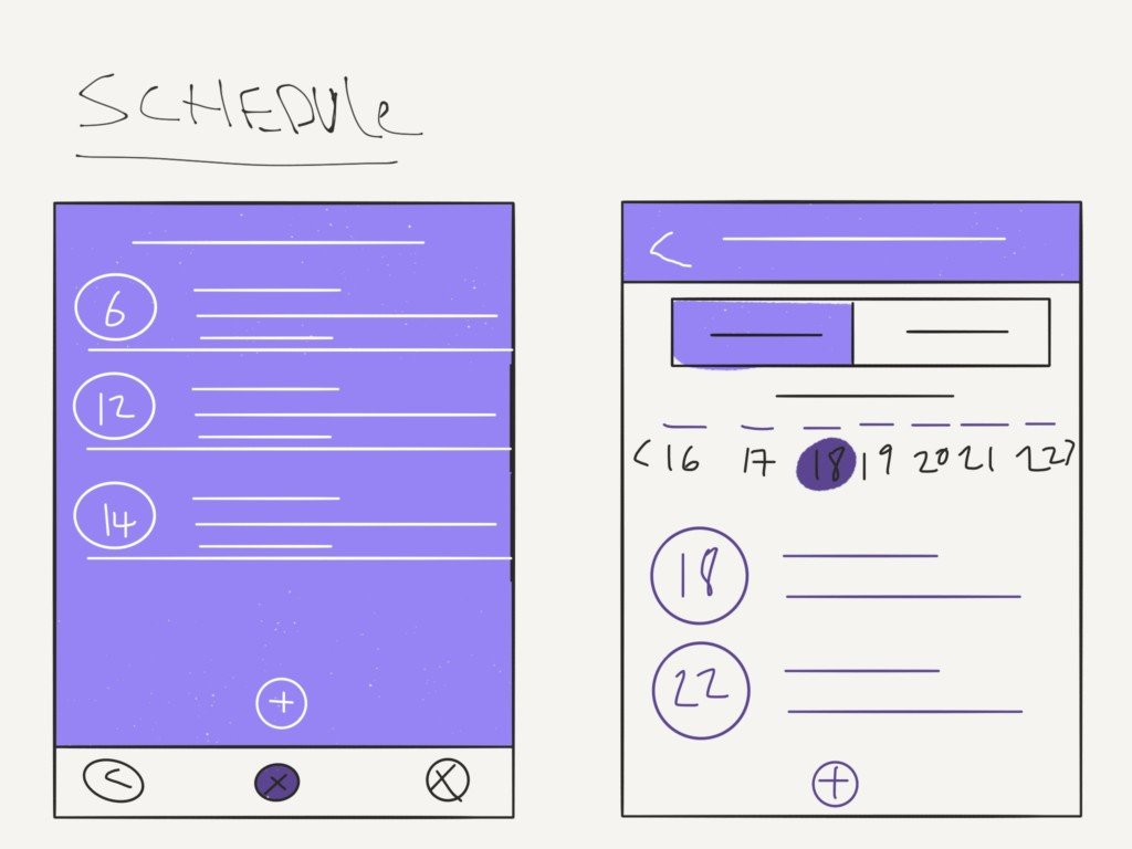
How the Schedules events and reminders can be displayed on other panels in the house.


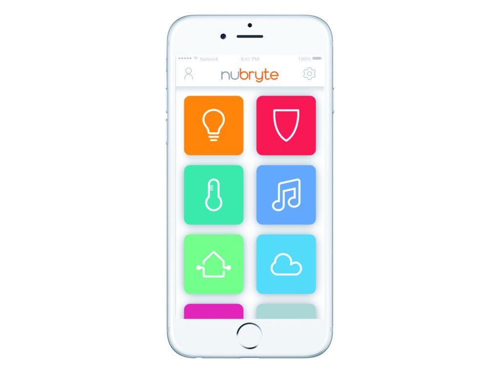


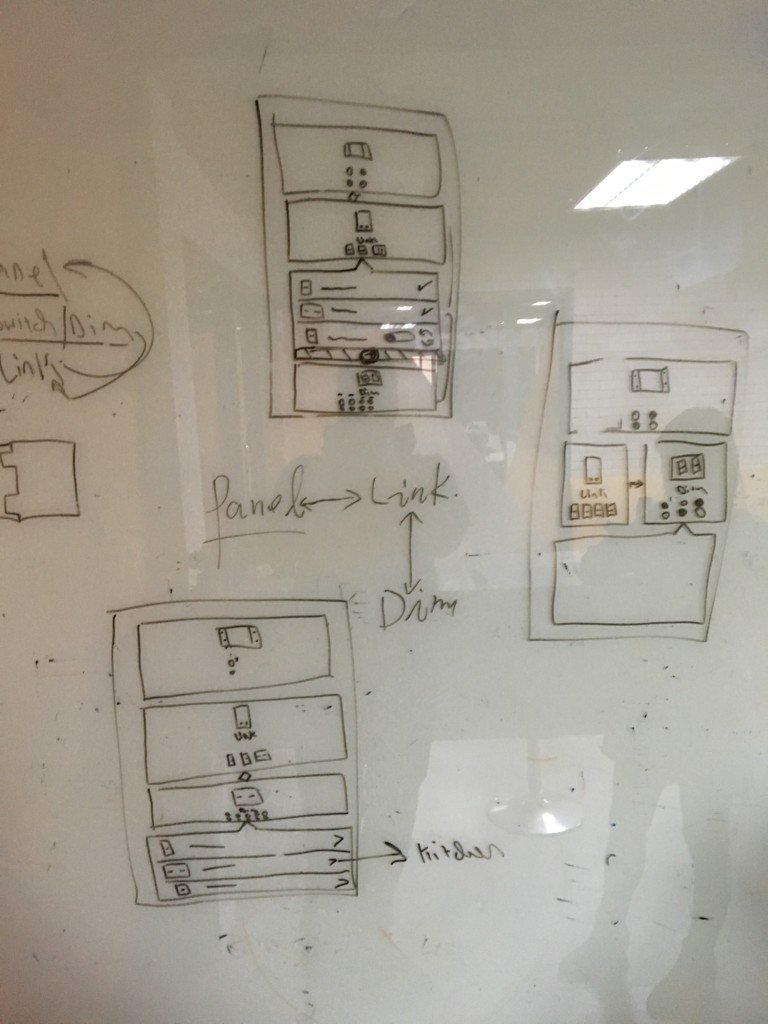
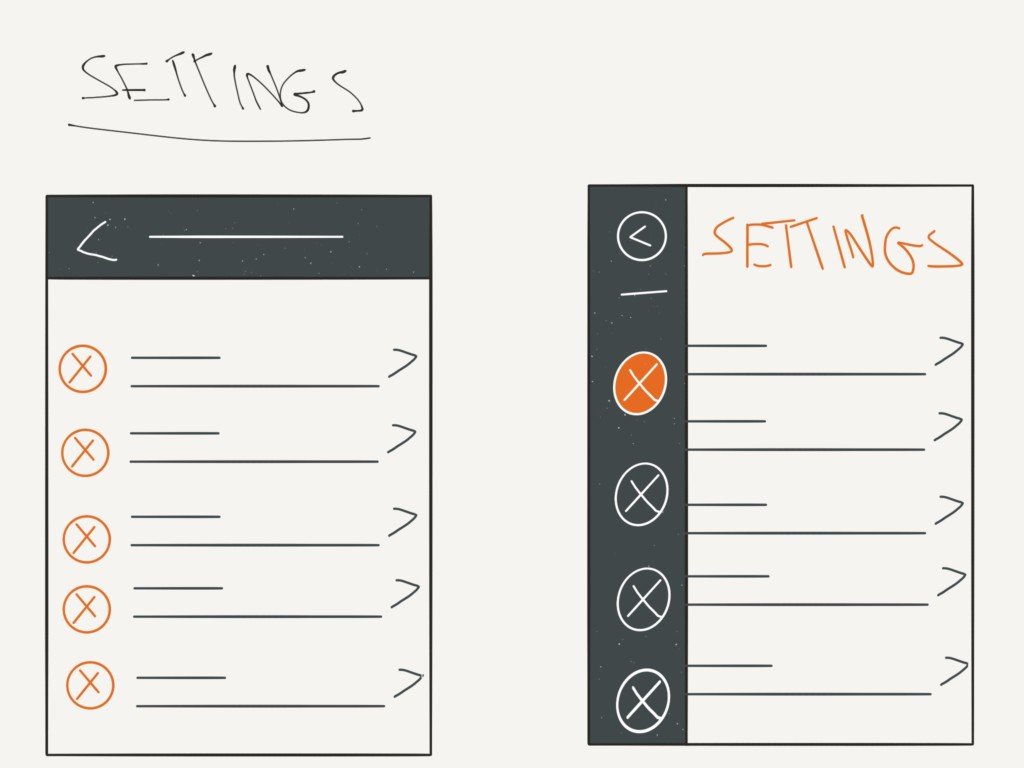
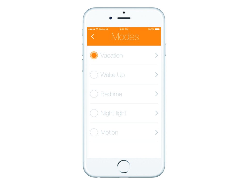
In tackling these design issues we looked at each of the features Anchoring bias and redesigned as needed.
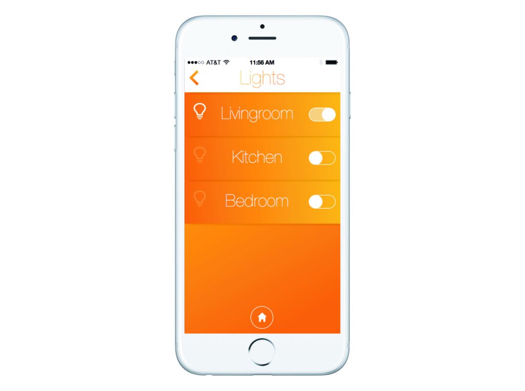
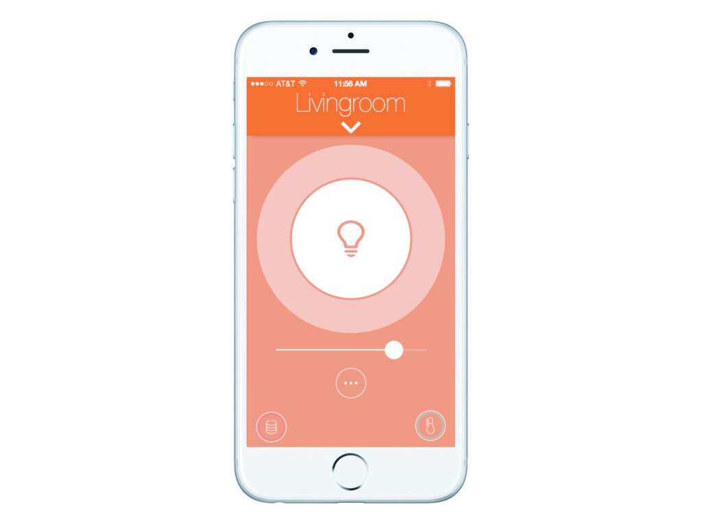
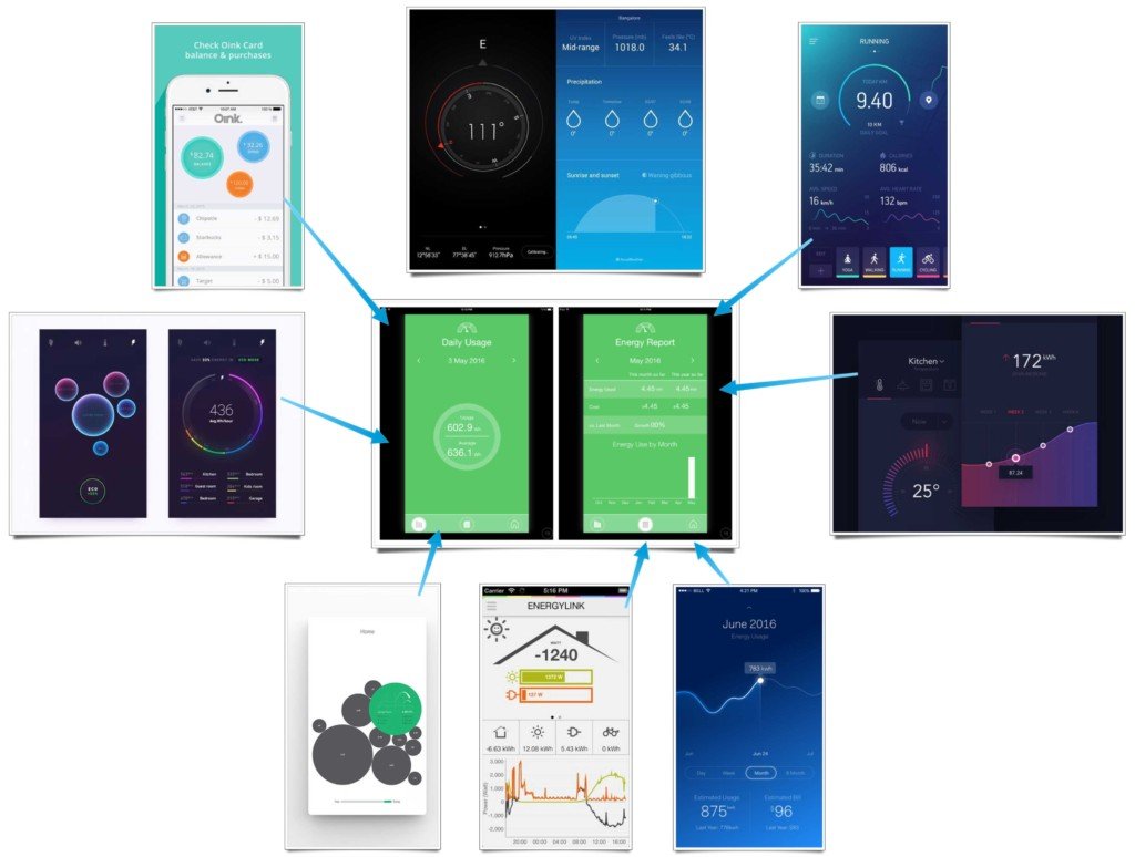
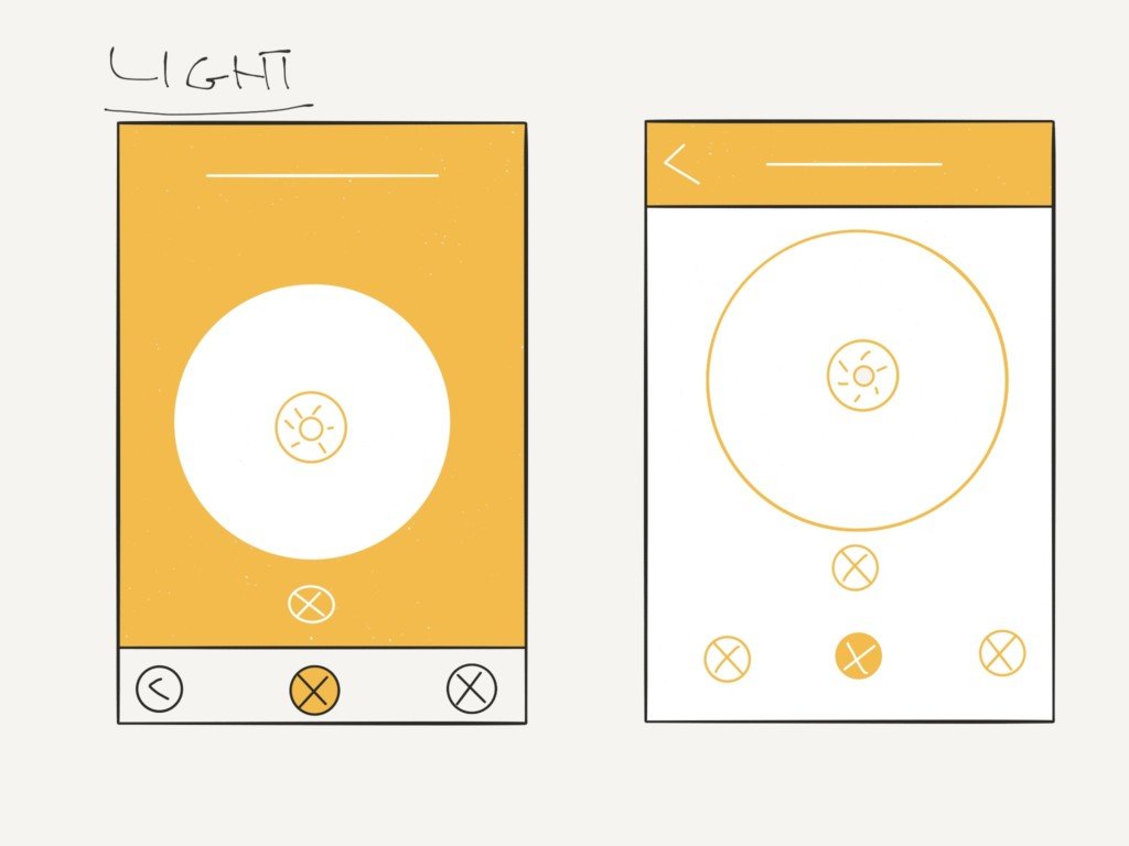
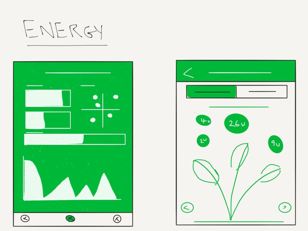
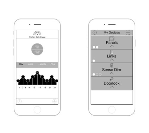
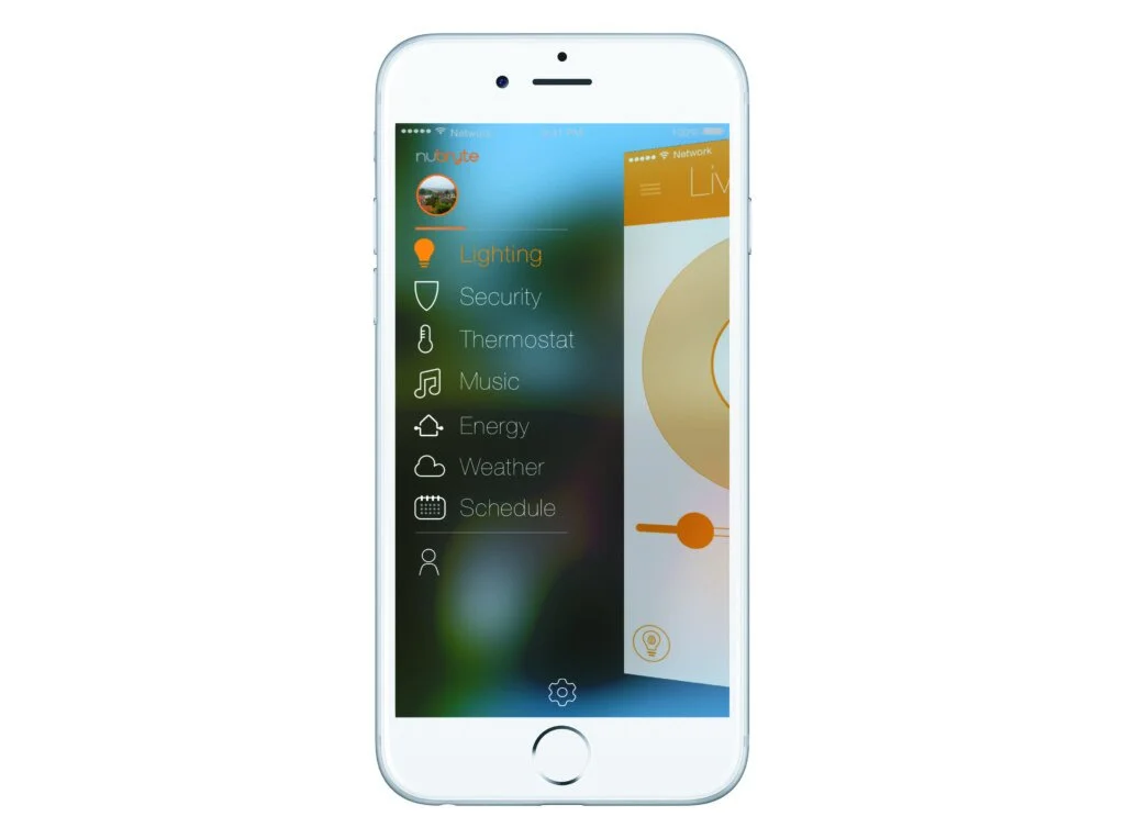
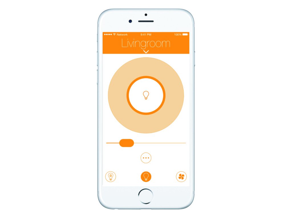
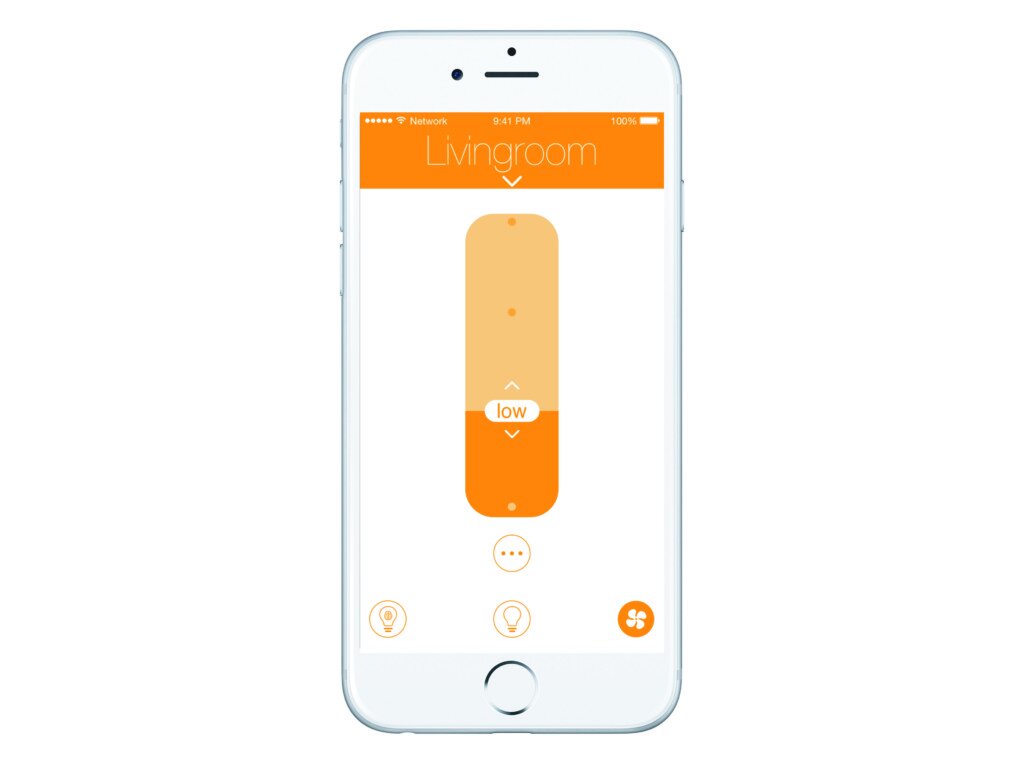
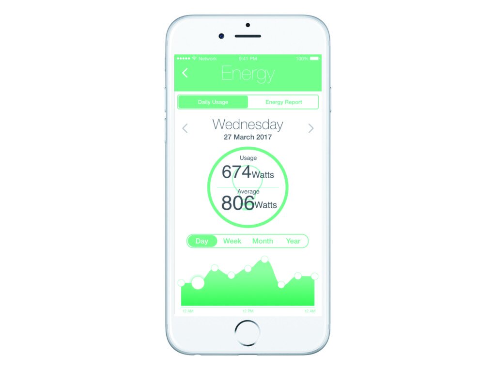
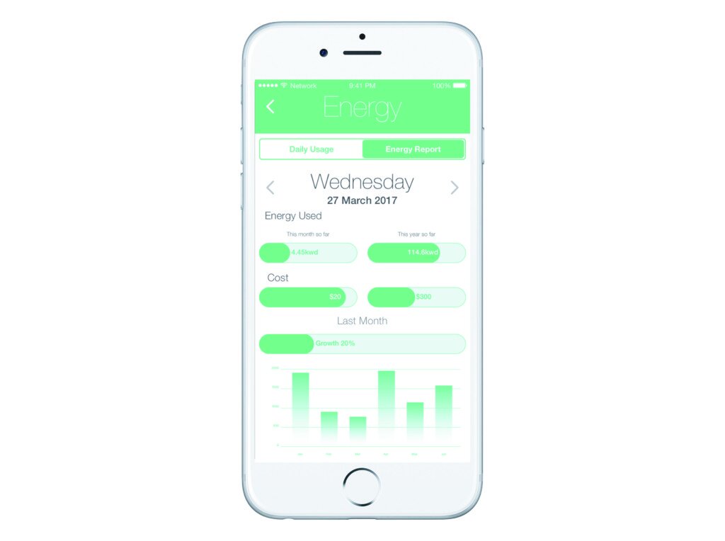
For the Lighting section of the App. Incorporating Millers three click theory, users would tap on the lighting section. They would then see a list of all the connected lights with a quick on/off button and a light dim slider where applicable. The findings of the user testing for the Energy data showed that users required more in-depth data on the App compare to the panel which was more of a second screen viewing. With this, the Daily usage tab displayed the energy usage and a chart allowing the user to view the data in a Day, Week, Month and Year. The second recording data tab created an easy to interpret slider chart showing energy usage, cost and last month usage chart. These variables were shown to be the most requested in the user testings findings.
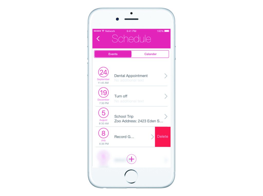
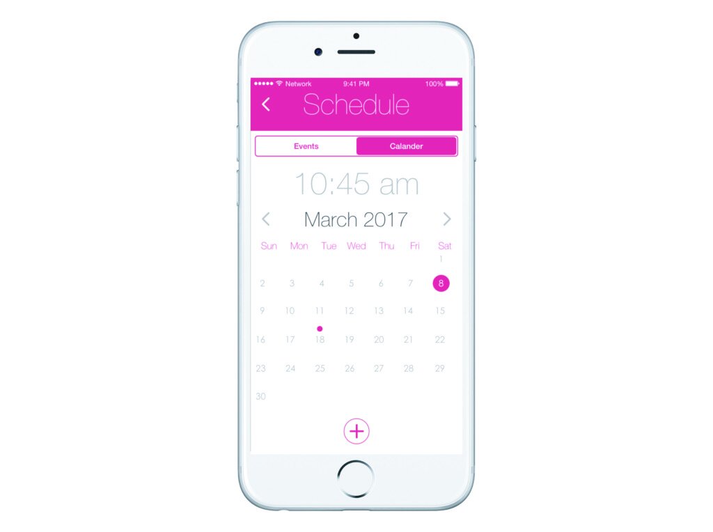
Finally, the Schedule section which was the most requested improvement was not only better integrated with google calendar it was also better redesigned to show relevant data. Times an Dates are in the large text along with a better text intro giving more information on the event. When users create an event they could now send it to one or all of the panels in the home.


While the findings of the panel were less control the app was different more control was needed. The Redesign of the Gen-2 App had to enable each element a user can interact with to give smooth feedback without unforeseen changes. The UI should be effective, not only beautiful.
With the redesign of the panel, we had to optimize the physical design, to enhance software features. Core functions of the App are designed for lightweight interaction. Leveraging the new capabilities of haptic feedback in the new generation of phones, distinct haptic feedback from a users actions, lets them know what they have done and what to expect. With this redesign we wanted to leverage the best functions of both the Panel and Apps capability’s, with this redesign both the Hardware and software developed together can define a singular experience.