
Bublup App
The users My Feed section was originally intended to have a better usability in order to help the user experience of the app, but in general, that’s not always been the case in practice since notifications can quickly become an annoyance if they’re designed poorly or not managed properly.
This was the challenge when creating an experience for the
Bublup app, Bulblup is ground-breaking technology that changes how people interact with information and with each other.
I had been asked to consult on the My Feed section and more importantly address how users notifications would be handled.
Thanks to their prevalence, it’s easy to take notification endorphin induced design for granted, which usually leads to unsatisfactory UX.

Notifications should always be as unobtrusive as possible. They shouldn’t interfere with what task the user needs to accomplish at any time, yet they should obviously still achieve their intended purpose of letting users know of something important, that the user has asked to be notified about.
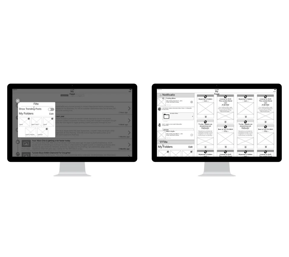


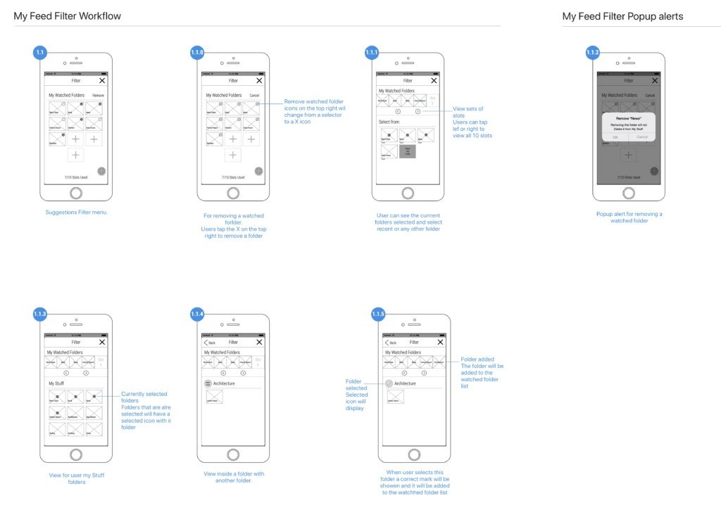


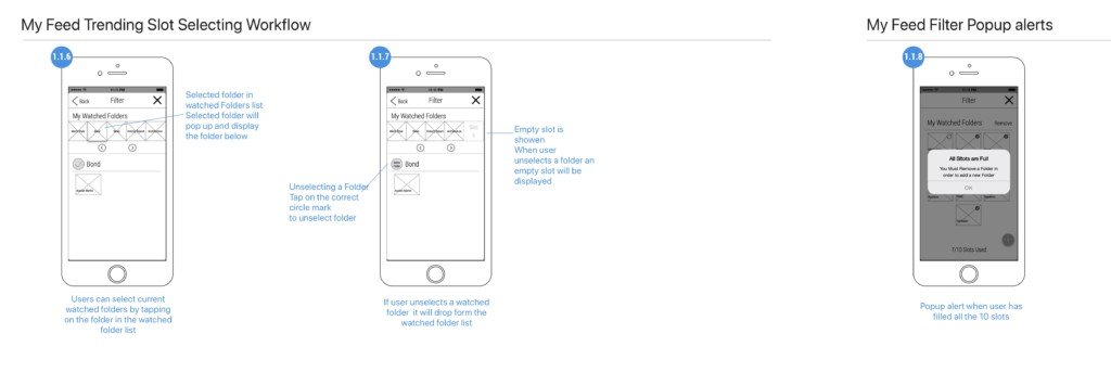


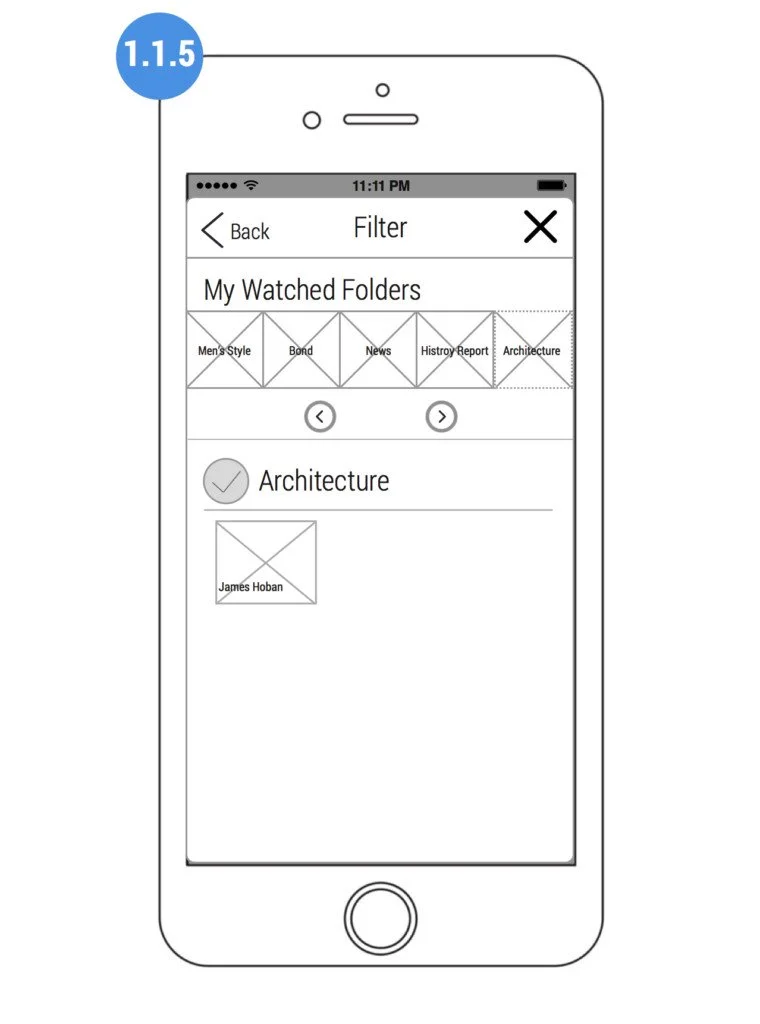


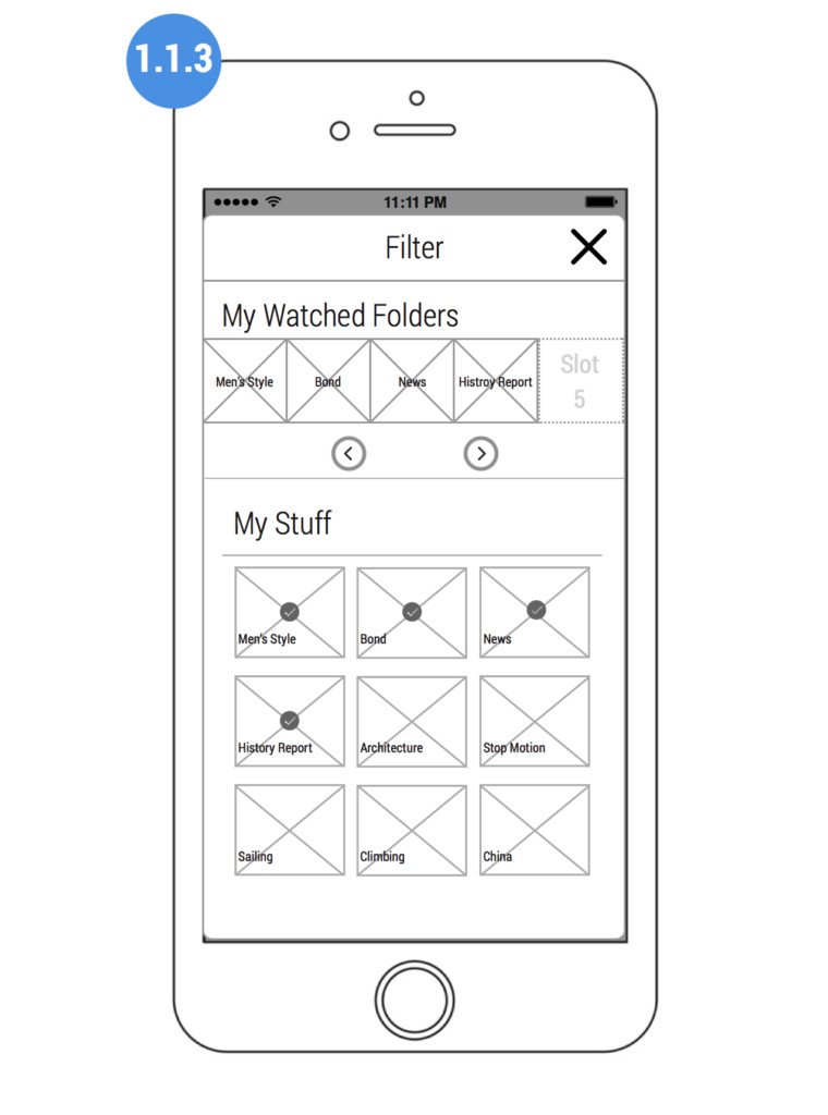


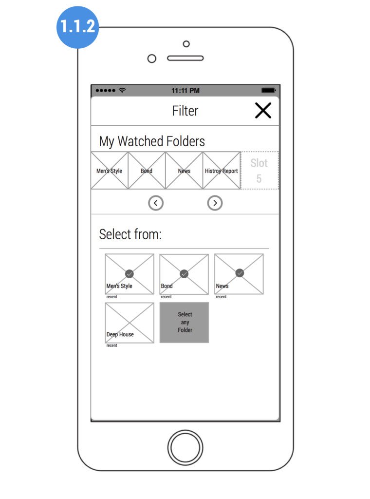
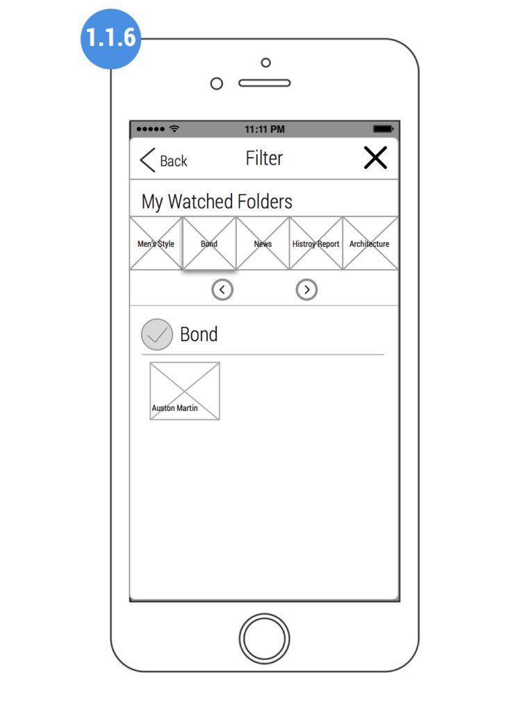
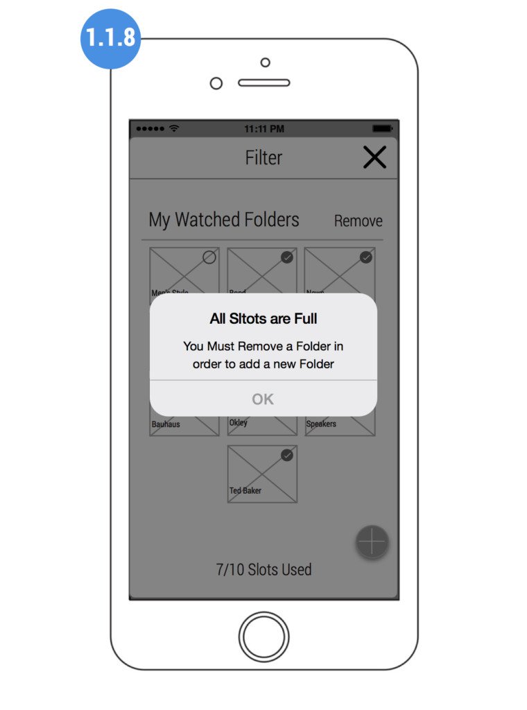
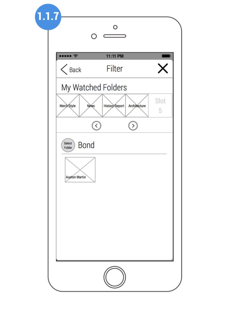

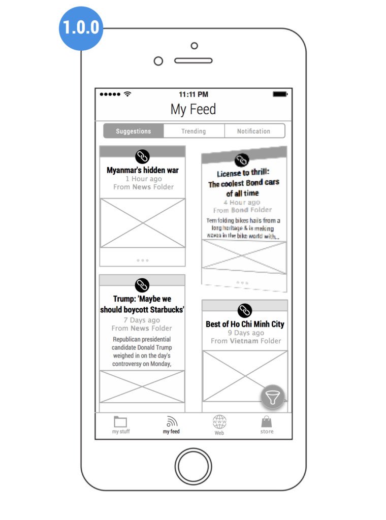

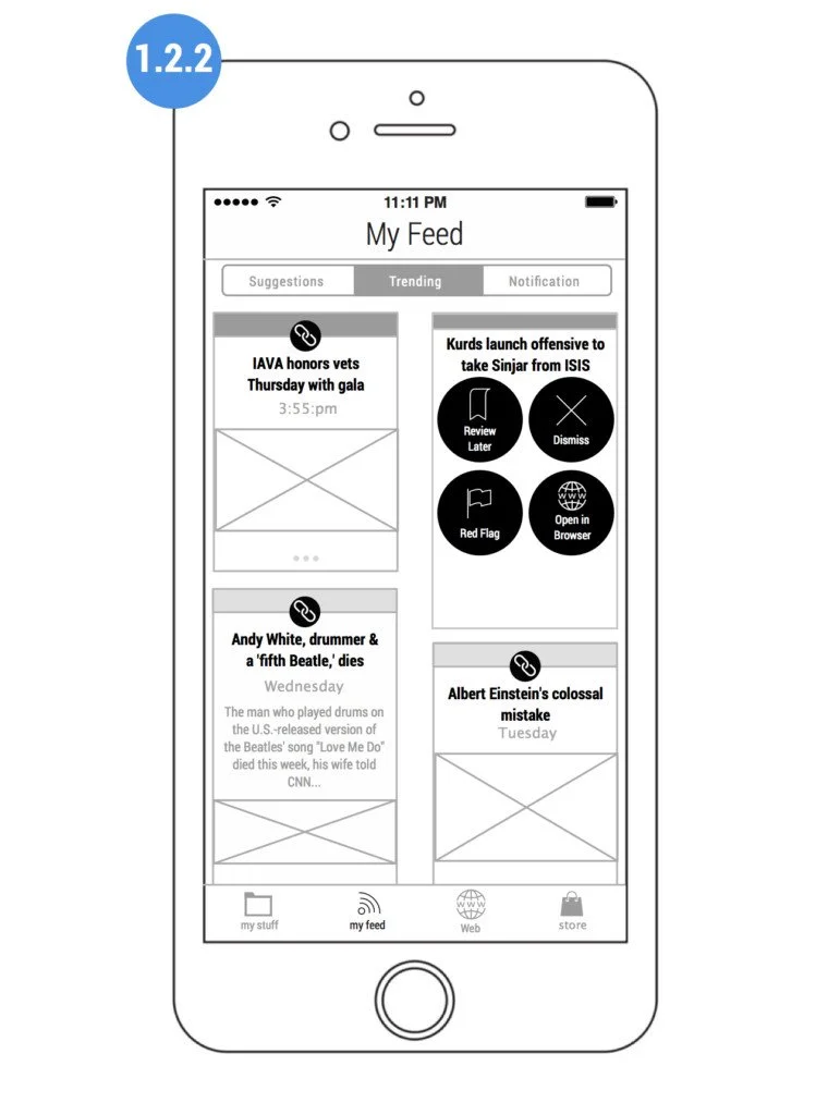

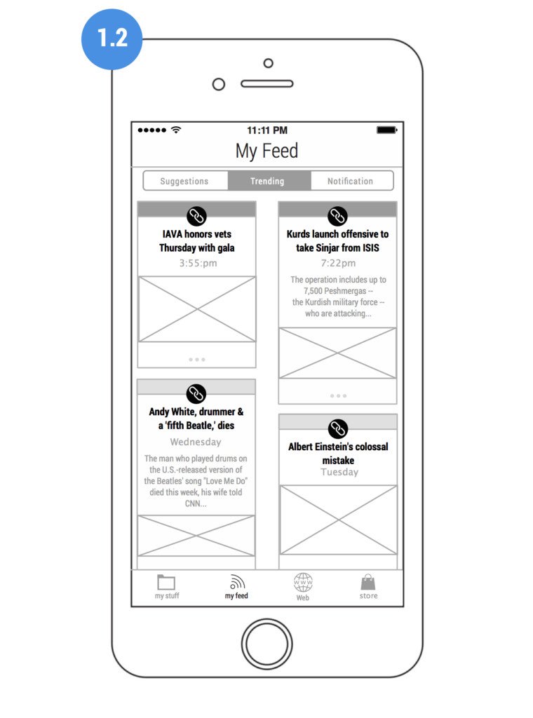
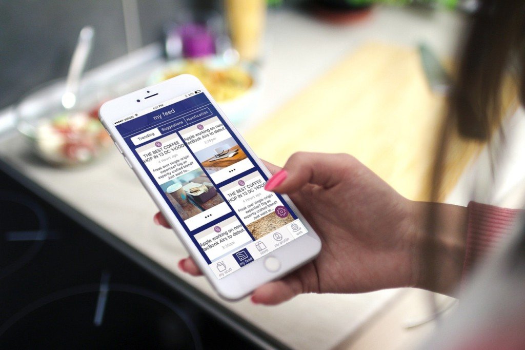
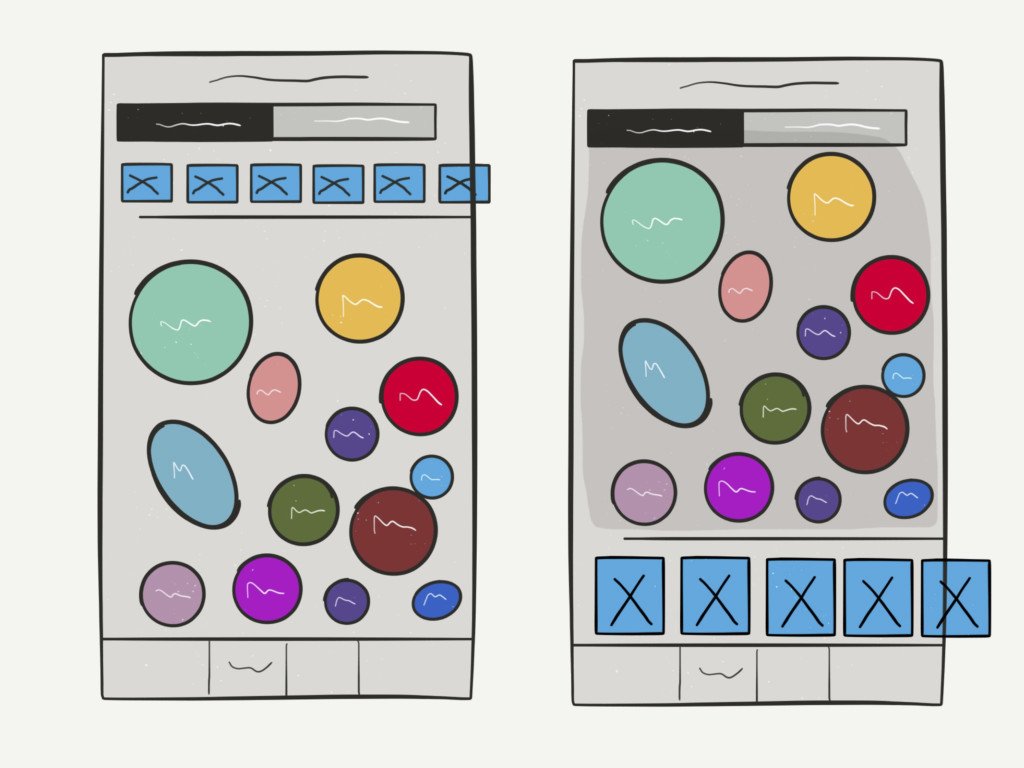
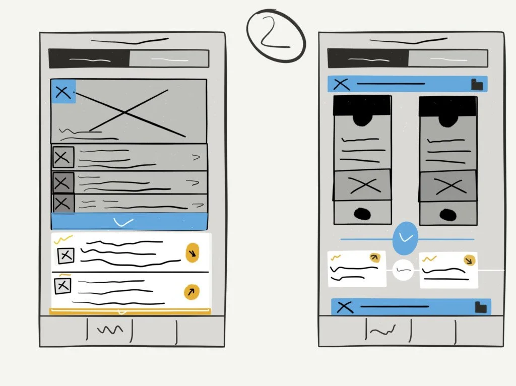
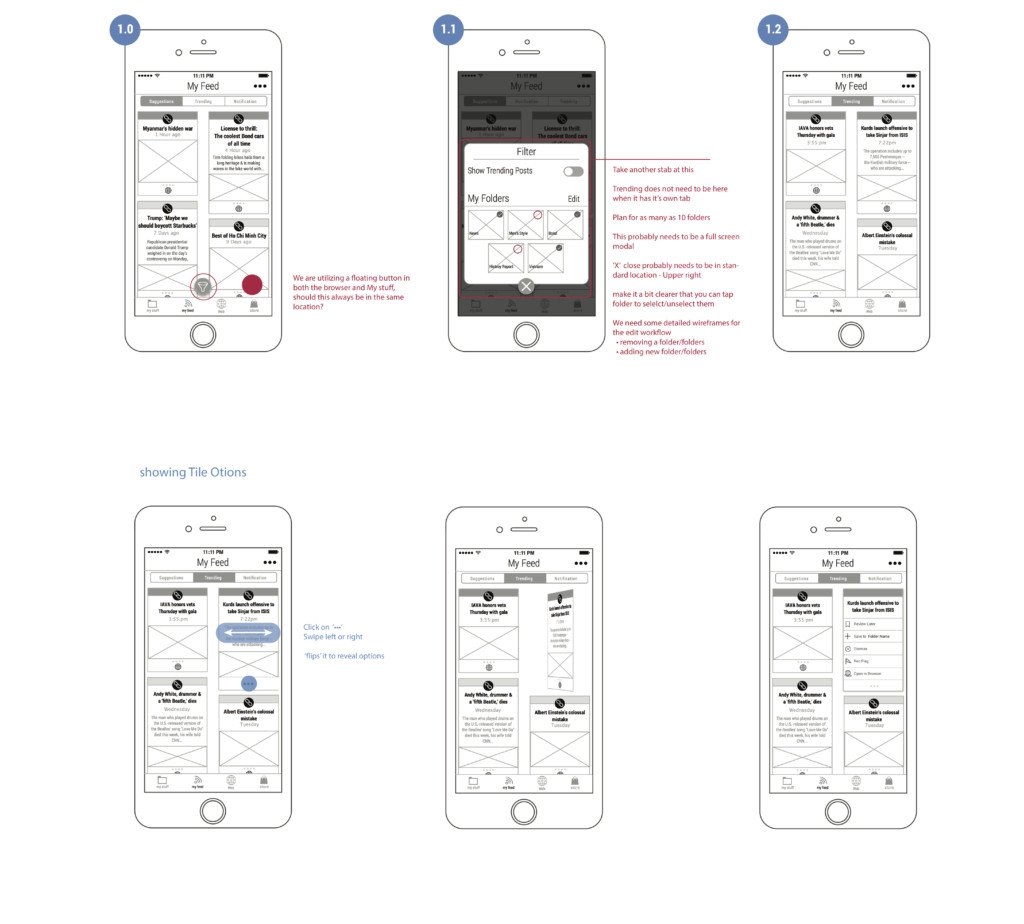
That’s is why the approach of the My Feed section to have the most common notifications users receive, placed in the My Feed section. This included trending, suggestions, and notifications.
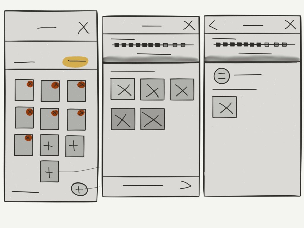
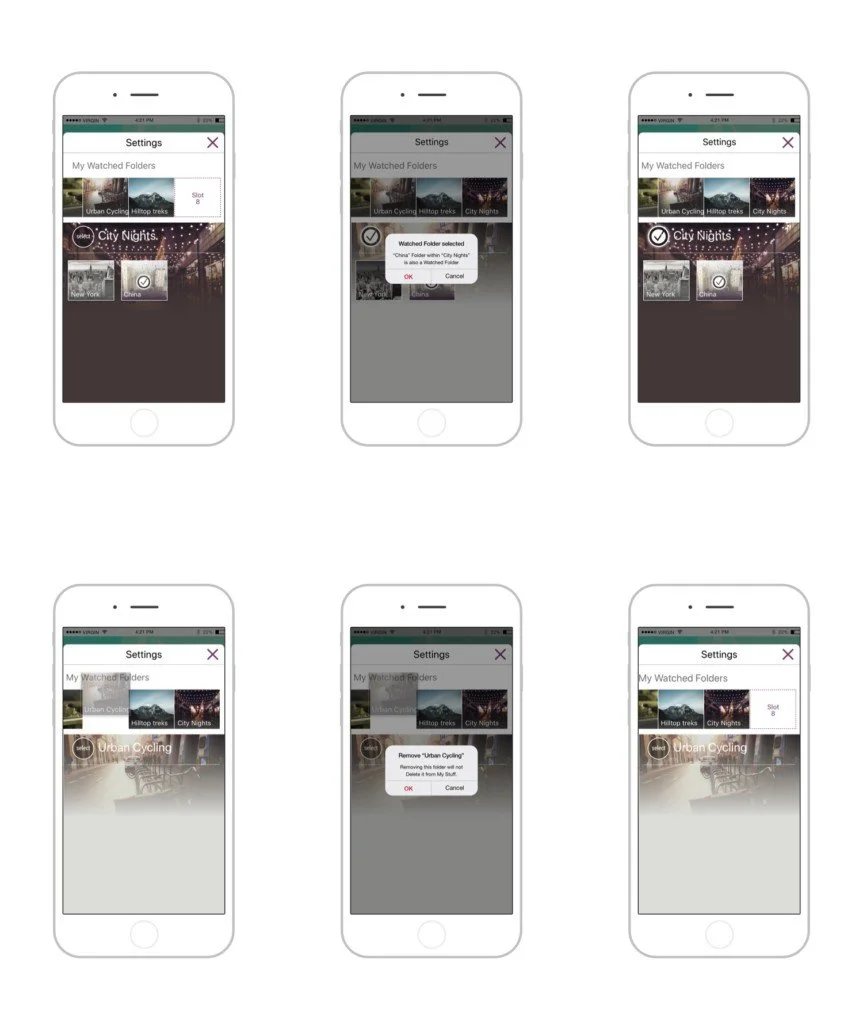
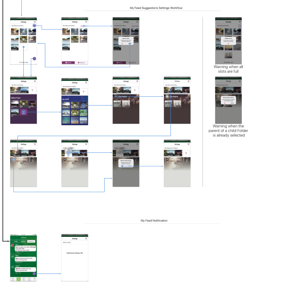
The user can edit these sections and receive notifications as they happen or when certain tagged words are found or if a preset number of links have been collated, the My Feed section sends small notifications that slide in at the top down of the screen. Although they’re small, the user will always see them because the movement catches the eye, and their importance and order means that they’ll never obstruct the user with every single notification.


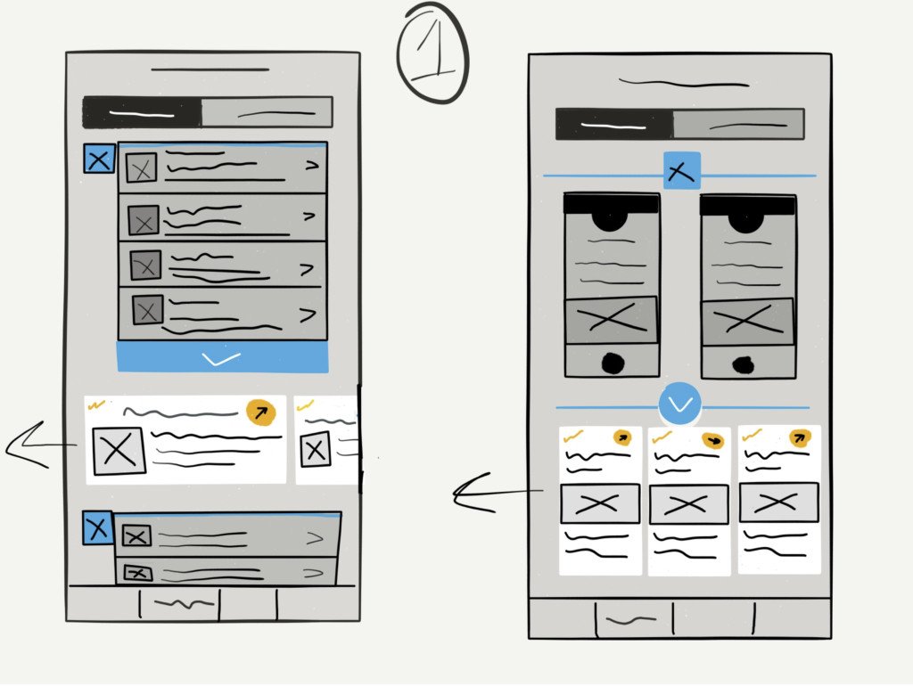
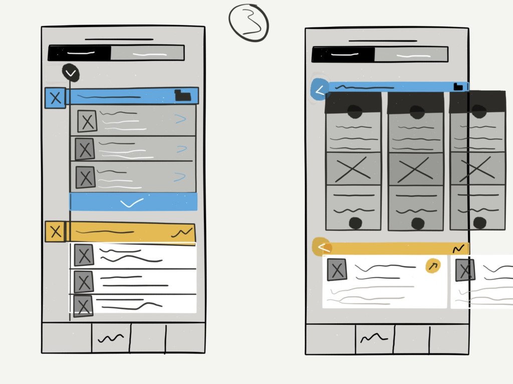
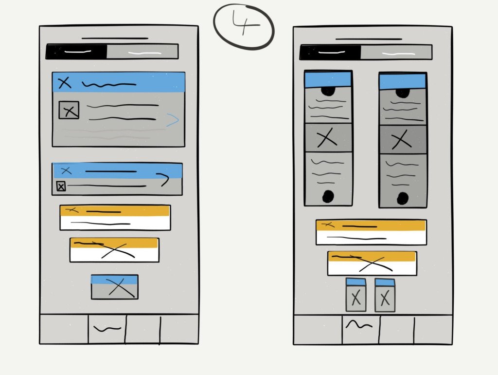
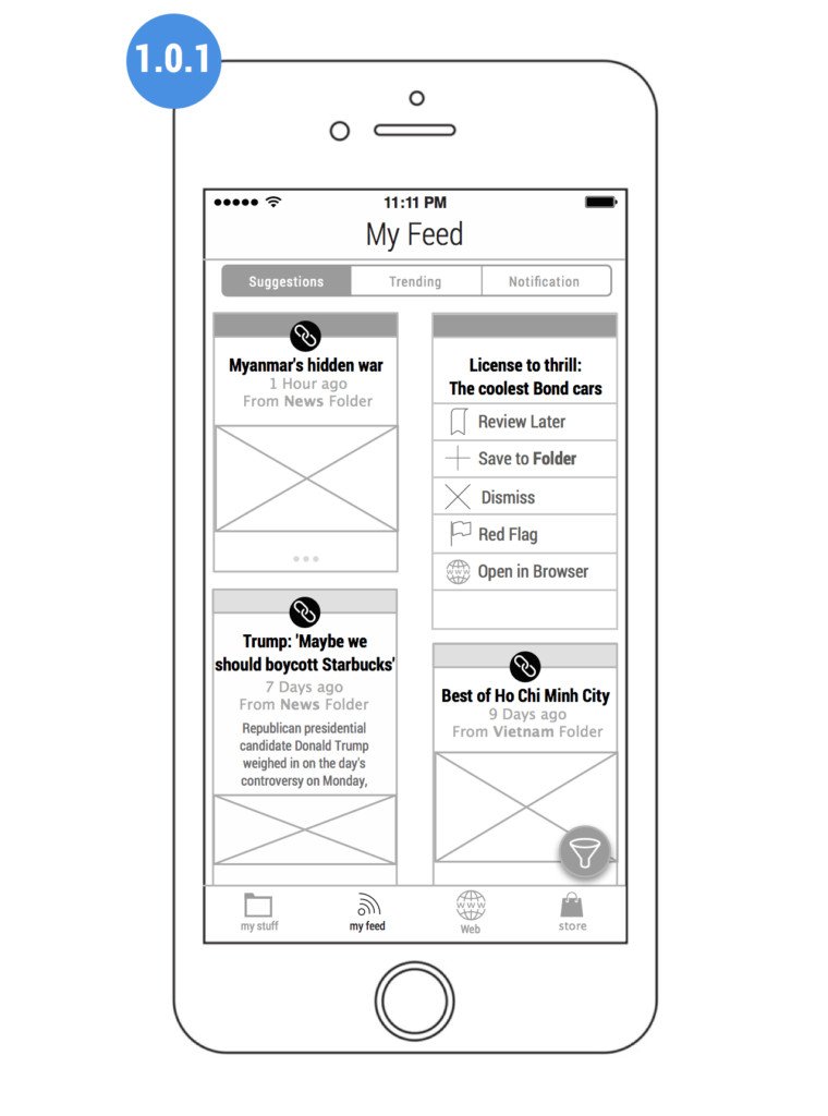
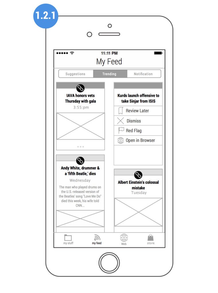
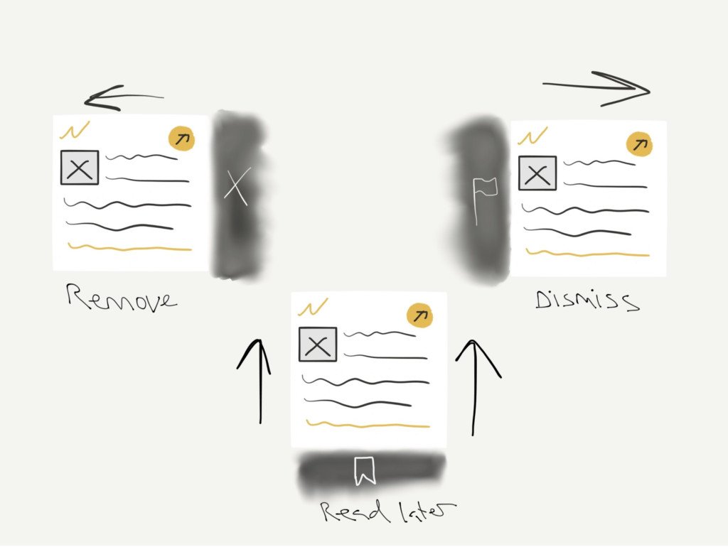
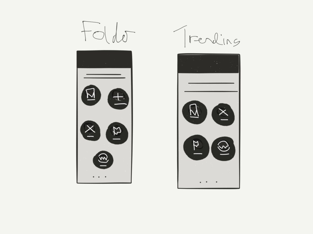
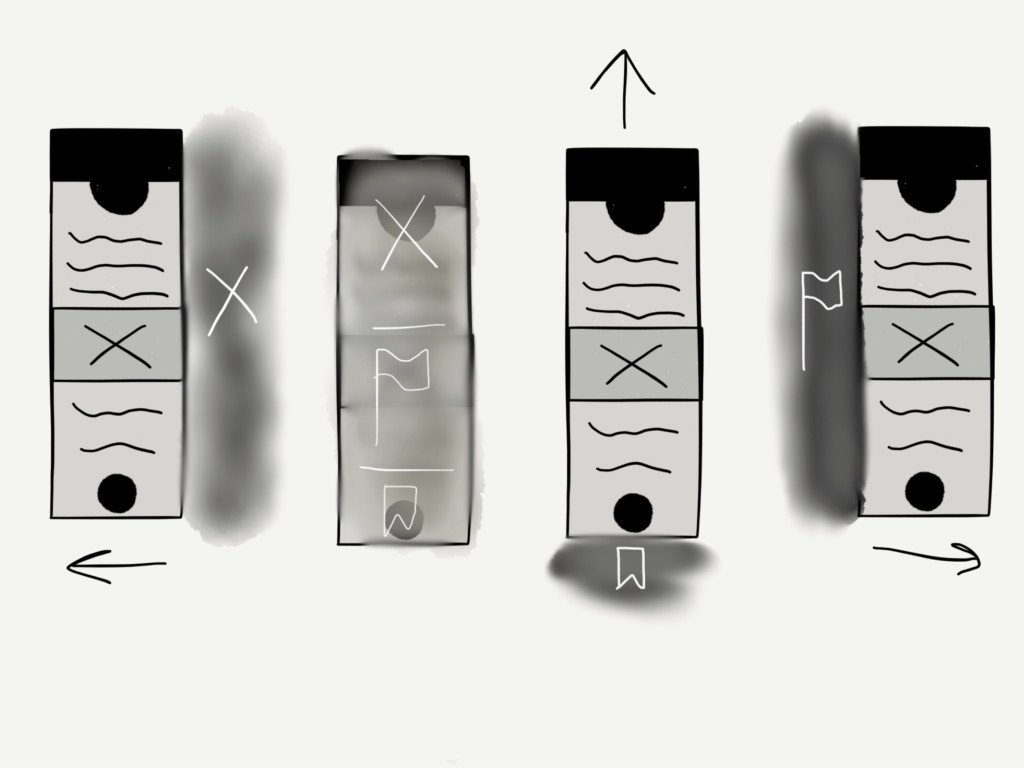
The second issue I was asked to address was what and how the user saved or shared the links they found. this was done with a number of animations as to how the share and storing options were made aware to the user.